

Design comparison

Community feedback
- P@underhrPosted 28 days ago
Many things. I'm no professional so take what I say with a grain of salt
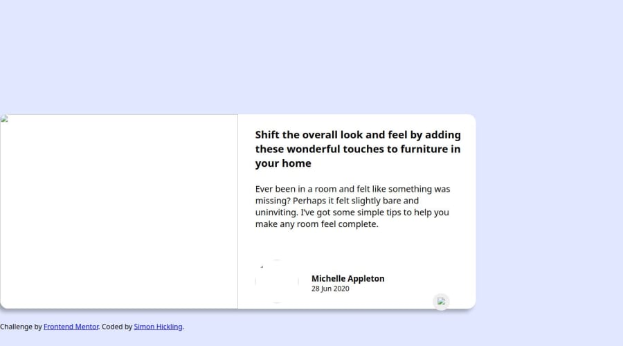
- Your images likely aren't showing up because you've used a folder name with a space. From what I know, this can cause problems. I recommend never using spaces when creating folder or files for development, use "-" as a replacement. You can change the name to Task1 or Task-1, but either way you don't need to include "../Task 1" at all, as this is leaving & entering the same folder. Instead of
src="../Task 1/images/drawers.jpg",usesrc="images/drawers.jpg"for all images.- To center the card properly, remove
.container {
    margin-top: 33vh;
}
& add
body { display: flex; justify-content: center; align-items: center; }-
Your colors are also off. They're available in the "style-guide.md" file, so I highly recommend using those, rather than trying to guess. Definitely go back & update the text & background colors to make the design look much more similar.
-
Check the smaller details, like the size of the profile image, the all caps in "SHARE", things like that to add the finishing touches.
Keep in mind I didn't test this code out myself, this is just based on observations, so go back & try this out & fix what's needed. other than those big things, your positioning & javascript is good! you managed to make your javascript much simpler than i did to accomplish the same thing, so kudos.
Happy coding!
0


Please log in to post a comment
Log in with GitHubJoin our Discord community
Join thousands of Frontend Mentor community members taking the challenges, sharing resources, helping each other, and chatting about all things front-end!
Join our Discord