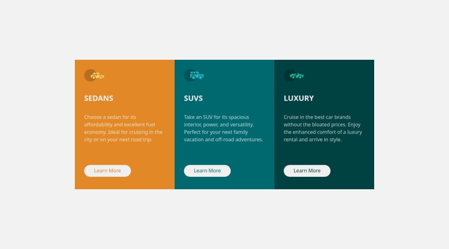
Design a 3-column preview card using html and css


Design comparison

Solution retrospective
my html struture
What challenges did you encounter, and how did you overcome them?responsiveness of the page
What specific areas of your project would you like help with?responsiveness of the page
Community feedback
- P@CrtykwodPosted about 1 month ago
Hello, @Eleniyancode! Congratulations on completing the challenge! The HTML is well structured, but you shouldn't have more than one
<h1>in your code.Now, about the responsiveness of the page, it's good, but it could be better, media-queries are very limiting and you can almost always replace them with other resources, so, in your main, I would keep the grid as it is, but increase the width, and set it to
max-width: 30rem, so the layout remains adequate even on slightly larger screens.
As for@media (min-width: 40rem), I recommend you do it this way:@media (min-width: 40rem) { max-width: 60rem; grid-template-rows: 1fr; grid-template-columns: repeat(auto-fit, minmax(200px, 1fr)); }This completely removes the need for
@media (min-width: 60rem)and allows for a more responsive and dynamic design based on the device's screen size.Marked as helpful1@EleniyancodePosted about 1 month ago@Crtykwod GM boss, thanks for taking a look at my code and for the feedback, i will implement your suggestions and repush my code, please let me know whether it look better
1P@CrtykwodPosted about 1 month agoWell done with the improvements, @Eleniyancode!
The design looks a lot better!!!!You're using margin bottom and margin top in the
main, which, on some screens, causes the content to stick to the side of the screen and have a weird border on the top.
This is more of a design decision, so if you prefer the content to occupy the entire screen, remove the margins.
Now if you want the content centered and separated from the background of the page, you can setmargin: 20px 15px(15px side margin), or you can replacemax-width: 30remwith something likemax-width: min(30rem, 95%)andmax-width: 60remwith `max-width: min(60rem, 95%).Marked as helpful1@EleniyancodePosted about 1 month ago@Crtykwod I am grateful for checking the code again, I will implement the observation you made right and away and push the changes again, thank you but can I ask if you can at least drop me your email or any social accounts that I can use to communicate with you, I will so much appreciate your guidance towards my aim of becoming an expert frontend, thank you once again
0P@CrtykwodPosted about 1 month ago@Eleniyancode ofc, call me on discord, my username is crty. ^-^
Marked as helpful1

Please log in to post a comment
Log in with GitHub
Join our Discord community
Join thousands of Frontend Mentor community members taking the challenges, sharing resources, helping each other, and chatting about all things front-end!
Join our Discord