Not Found
Not Found
Not Found
Not Found
Not Found
Not Found
Not Found
Not Found
Not Found
Not Found
Not Found
Not Found
Not Found
Not Found
Not Found
Not Found
Not Found
Not Found
Not Found
Not Found

Submitted

CSS ONLY MENU

Radasin 620

@Radasin

Desktop design screenshot for the Agency landing page coding challenge

This is a solution for...

  • HTML
  • CSS
  • JS
2junior
View challenge

Design comparison


SolutionDesign

Solution retrospective


This is a solution to the Sunnyside agency landing page challenge on Frontend Mentor. Frontend Mentor challenges help you improve your coding skills by building realistic projects.

Note: Delete this note and update the table of contents based on what sections you keep.

Users should be able to:

  • View the optimal layout for the site depending on their device's screen size
  • See hover states for all interactive elements on the page
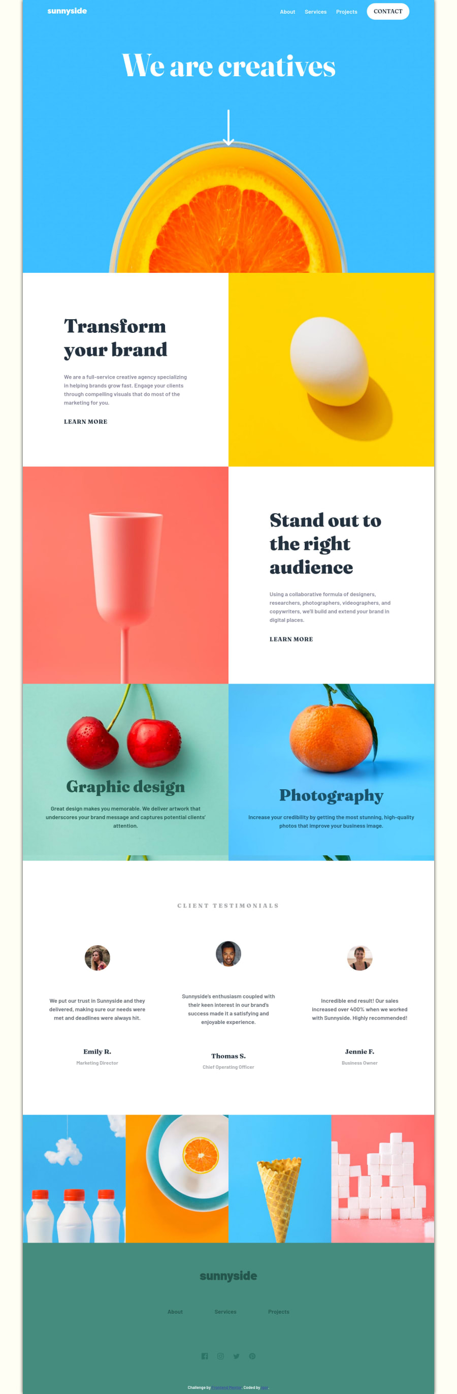
  • Semantic HTML5 markup
  • CSS custom properties
  • Flexbox
  • CSS Grid
  • Mobile-first workflow

How to make a menu with CSS only.

.nav-bar__menu {
   position: relative;
}
.nav-bar__list {
   position: absolute;
   display: none;
   list-style: none;
   background-color: var(--WHITE);
   color: var(--DARK-MODERATE-CYAN);
   background-color: var(--WHITE);
   top: 200%;
   right: 10%;
   padding: 4rem 50%;
   flex-direction: column;
   justify-content: flex-start;
   align-items: center;
   gap: 3rem;
}
:is(.nav-bar__menu:hover, .nav-bar__menu:focus-within) .nav-bar__list {
   display: flex;
   width: 90vw;
   border-right: 20px solid transparent;
   border-top: 20px solid #3ebfff;
}

Community feedback

P
visualdennis 8,375

@visualdenniss

Posted

Hey there,

your solution looks good overall, congrats on completing the challenge successfully! I'd suggest adding some hover states to links. Here is a great tutorial with variety of text underline animations on hover: https://www.youtube.com/watch?v=oVASlcO2ch8

Also it looks like you have added a background color to the body, the area outside of your container / app for very large screen-sizes, but in my opinion the design is already very colorful and introducing additional color might be hard to match the current color palette as in this case. I'd suggest using white or and off-white value instead to make it look more neutral.

Hope you find this feedback helpful!

Marked as helpful

1

@G18siqueira

Posted

Congratulations on completing the challenge!! If I could give you a tip, it would be to calmly check the measurements of the elements and the details of the layout to be as close as possible, using measurements like ''rem'', ''vw'', ''vh'', '' fr'', of course each one with its respective importance, in addition to checking small details, such as the ''hover'' in the links, and the color palette used in the layout, I believe it would add a lot to your project!

Marked as helpful

0
Radasin 620

@Radasin

Posted

I will try to fix it.

0

Please log in to post a comment

Log in with GitHub
Discord logo

Join our Discord community

Join thousands of Frontend Mentor community members taking the challenges, sharing resources, helping each other, and chatting about all things front-end!

Join our Discord