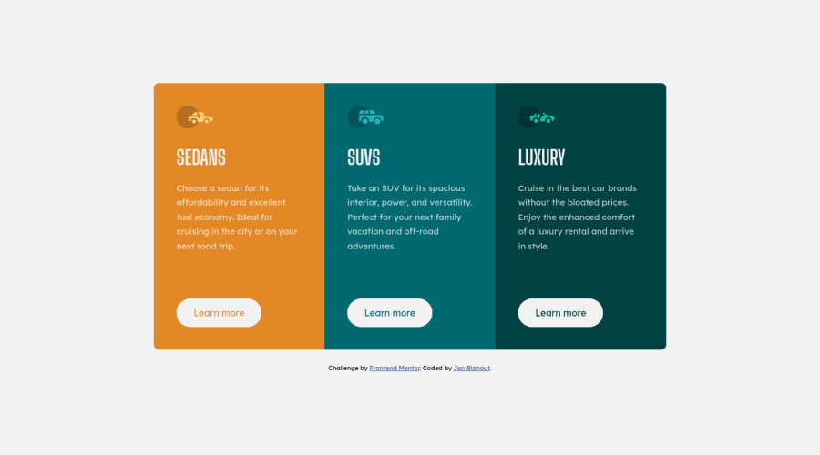
Design comparison
Solution retrospective
Hi all,
so I have to say, I am quite proud of this one. Done everything by myself. The butotns were little tricky and I had to use web (udemy course that i have bought some time a go) because i remembered I have done something similar in the past.
Mobile version was quite interesting and I would like to get help on that. On mobile I have switched from grid-template-columns to rows, but the colums are still there and I had to span them over 1 colums such as :
.sedans { grid-column: 1/-1; grid-row: 1; }
is there any better way to do it to have just 1 column ?
Thank you very much for taking your time and I see you in the next challenge ! :)
Also for anyone reading this and struggling. Take it slowly, it takes time to learn things. You have to experiment as much as possible. It took me good time to learn some tricks to center a container in the middle of the screen :D
Community feedback
- @jatsanPosted over 3 years ago
Hey, JanBlahout!
Congrats on the solution submission.
You should check out CSS Tricks -- A Complete Guide To Grid. It's a really good resource for learning CSS Grid.
Happy Coding!
0 - @Dharmik48Posted over 3 years ago
Hey👋,
I think a better way to fix the grid issue is to add
grid-template-columns: 1frin the media query and you don't need the spans. Also try to use units likeemandreminstead of px.Apart from these your solution seems really good! Keep it up👍
0@JanBlahoutPosted over 3 years ago@Dharmik48 Hello,
Thank you so much for the input.
The EM and REM is the next step. set body{ font-size: 62.5% } and take it from there.
The grid-template-colums: 1fr seems really clever ! Thanks
0
Please log in to post a comment
Log in with GitHubJoin our Discord community
Join thousands of Frontend Mentor community members taking the challenges, sharing resources, helping each other, and chatting about all things front-end!
Join our Discord
