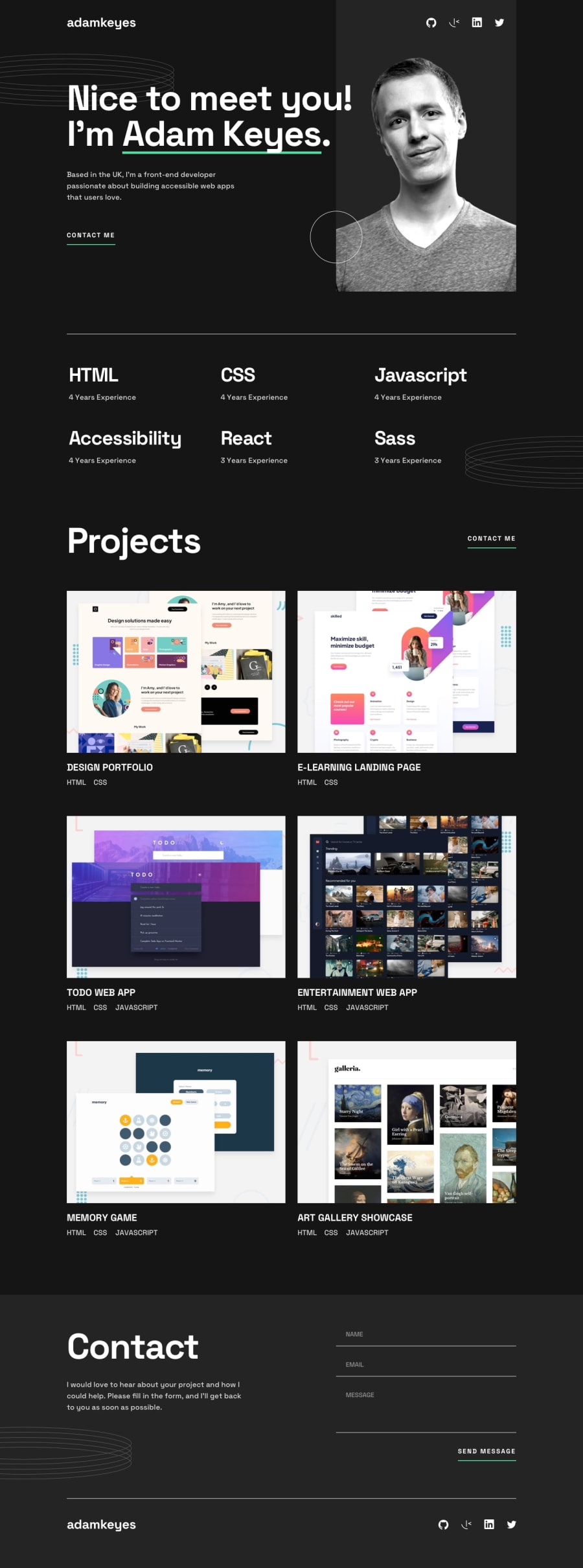
Design comparison
Community feedback
- @cuftamasterPosted over 1 year ago
hello David McLean.
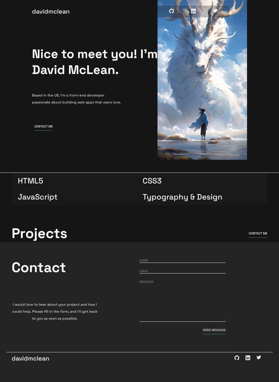
i see u have an artistic side to you, and probably background in design i would love to point out the simplest and the hardest thing about writing code and that is structure, naming and elegance in writing least amount of code possible
so first of, learn to use semantic elements in html, i see u used main, nav, some headers and footers, that is a good start, now throw in some sections, cards, articles... second learn about naming conventions like smacss, and bam
you need to approach a page structure and naming with modularity and repeatability in mind for example u defined a custom property --custom-white then made a class .title-color { color: var(--custom-white);, which then u used in html when u needed that color on buttons
there are a couple of things wrong with this way of doing things first of why add a class in html to an element that already has its class of button, like this you have have increased codependency between your html and css, and that is a bad practice also on the buttons u defined border-bottom 3 times, the correct one that would affect all the buttons all the time is commented out and then in your form you have .form-textarea and input, textarea with same styles as buttons. you cold of have covered all of that with one selector ... and that input in a span should be a buttonnow for the structure of the html, you should think of it like boxes within boxes if u want something to line up, put it in a box, and then manipulate the box position, or manipulate box content with flex or grid i see u used grid for most of the main and skill section, and that is fine, grid is powerful it can do a lot of things, but flex is so much quicker and much more used, so i would suggest learning learning its behavior.
because u used quite a complicated grid setup u have a couple mistakes, main header is to small for its p element, so it stickes out (smart making it one word but, not a good practice), between 1180px and 800px, h1 and p are overlapping.
you used a main wrapper to contain everything in main, and u used it as a grid, but then u didn't use a wrapper in any of the later sections. it is common practice when u have a page layout with centered content all throughout it to use a wrapper in each section, so that u can achieve that uniform look for all of the content, a wrapper with same width of course you have main header, and nav completely separate but you want them to line up at all times, well put it in a box(a div or make the whole thing a nav).
i see u used hr as a line, but u used them outside of any element, so they span the whole page, lining up with nothing, use them in a parent, like say wrapper, but hr is a block element by default so it will still want to span the whole page, change display to inline and width to 100% and no it will be 100% of the parent, although if u used a wrapper in all the sections u could use a border-bottom to achieve same effect with less code.
i hope some of this was helpful. best regards.
Marked as helpful0@davuplsPosted over 1 year ago@cuftamaster I genuinely appreciate you taking the time to share this knowledge. I will try my best to learn from your advice in the future.
0
Please log in to post a comment
Log in with GitHubJoin our Discord community
Join thousands of Frontend Mentor community members taking the challenges, sharing resources, helping each other, and chatting about all things front-end!
Join our Discord
