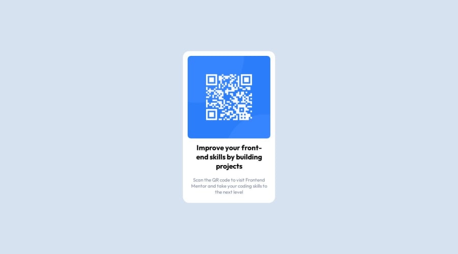
Design comparison
SolutionDesign
Solution retrospective
Overall I found the exercise easy, but I got a little lost to align the container in the center of the page, I had to research until I got the result, which I hope, will be the end!!
Community feedback
- @hitmorecodePosted about 1 year ago
Nice well done. Just one tip
- Make it a habit of using
min-height: 100vh;instead ofheight: 100hv;. With min height the page will be responsive to it's content. Height is a fixed height, so if you add content to the page eventually it will overflow
Marked as helpful0@luizotvioPosted about 1 year ago@hitmorecode Thanks for the tip, I will apply in the next challenges!
0 - Make it a habit of using
Please log in to post a comment
Log in with GitHubJoin our Discord community
Join thousands of Frontend Mentor community members taking the challenges, sharing resources, helping each other, and chatting about all things front-end!
Join our Discord
