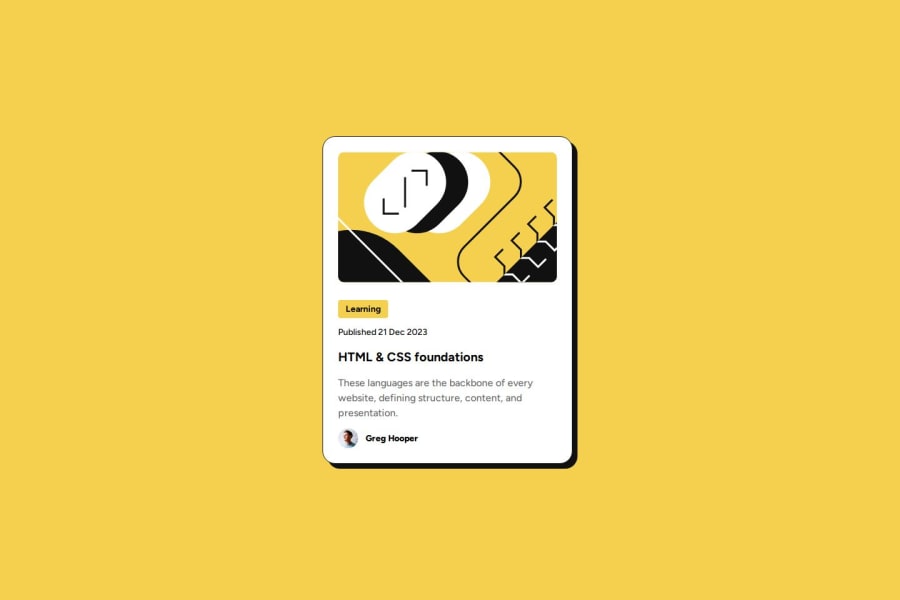
Design comparison
Solution retrospective
I am getting better are reading the Figma designs. This provides insight into card sizes and padding as well as the exact font sizes, line height etc...
What challenges did you encounter, and how did you overcome them?I was struggling for a while figuring out how to add margin around the card since it had a box shadow and I learned that box shadow + margin don't respect each other, therefore I had to add additional margin on the box shadow side.
What specific areas of your project would you like help with?I created a class called "card-container" and put it on the main HTML element. Would it be better to create a div or section and give it a class rather then adding that class on the main tag?
I added the colors to the :root of the CSS file for reusability. What is the proper way to do it for font-family or font-weights?
Basically how can I improve reusability using CSS variables?
Community feedback
- @hitmorecodePosted 5 months ago
Congratulations looks good. Just a few pointers
- You don't have to place everything inside a
div. Every element you used is a block element, this means each one of them claim their own place. By creating adivfor every single element adds to many layers, this can over complicate things if the page gets bigger. - You should take a look at Semantic html.
- Make it a good habit in applying CSS reset on your CSS. Here is a simple example of a CSS reset.
* { margin: 0; padding: 0; box-sizing: border-box; }- Try not to repeat yourself over and over. You have
line-height: 150%;and it's been used in four different places. Just combine all these into one CSS rule. - By default
letter-spacingis always 0. You don't have to add this in your CSS
I hope you find this helpful. Keep it up 👍👌
Marked as helpful1 - You don't have to place everything inside a
- @nadielotienePosted 5 months ago
Everything looks amazing! The only two things I can say is (if I'm being very nitpicky) that the h1 is a bit smaller and you could add to the .gitignore some of the extra stuff. Other than that, great job!
Marked as helpful1 - @ebenkaninPosted 5 months ago
Great job! Everything seems to have been done perfectly. Keep it up! I learned what to put in the main tag from your code. I always wondered where i'd put the main tag in a component like this. I'm glad i found my answer in your code.
1
Please log in to post a comment
Log in with GitHubJoin our Discord community
Join thousands of Frontend Mentor community members taking the challenges, sharing resources, helping each other, and chatting about all things front-end!
Join our Discord
