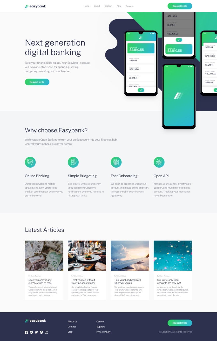
Design comparison
SolutionDesign
Solution retrospective
I will love to have a feedback on how I can make the toggle better
Community feedback
- @MartineauRemiPosted almost 3 years ago
Hey ! You did a great job :) Concerning the menu toggle, I think it should work with only this in your main.js file :
$(function() { $(".toggler").on("click", function(){ $(".nav-items").toggleClass("active"); }) })0@Captressketh001Posted almost 3 years ago@MartineauRemi Thank you, I will update that
0 - @Sam-GulikerPosted almost 3 years ago
Hi Captress,
You're almost there. You can still improve the HTML by using aria labels on the <a> tag. Next to that check the headings, H5 doesn't seem neccisary.
Design wise, check the fonts, paddings and buttons.
Have a good day
0@Captressketh001Posted almost 3 years ago@Sam-Guliker Thanks for this feedback. I will work on them
0
Please log in to post a comment
Log in with GitHubJoin our Discord community
Join thousands of Frontend Mentor community members taking the challenges, sharing resources, helping each other, and chatting about all things front-end!
Join our Discord
