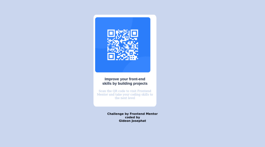
Design comparison
Solution retrospective
I wasn't able to get the matching colors for the text . I wasn't able to get the exact dimension as I had irregular dimensions compared to the design .
Community feedback
- @SoniBasantPosted about 2 years ago
Hi, 🙋♂️You made a good project.
I wanna help you to reduce accessibility report and your question of course.
As for your question regarding text colour 🎨-
- Use
Dark-blue: hsl(218, 44%, 22%);for "Improve your frontend..." - Use
Grayish-blue: hsl(220, 15%, 55%);for "Scan the QR code..."
Now about your report 📝 you got; In semantic coding, we need to take care of-
-
Landmark - Change
<div class="Qr">to<main>. This is for landmark problem. There should be one landmark. Don't forget to change closing tag. -
Level-one Heading - There should be at least one heading. So change
<p class="text">to h1. No need to give class and handle font-size in CSS. -
Use padding in place of
<br>. This will improve your dimension problems. -
Avoid px in CSS as much as possible. This creates problem in responsiveness. Instead use rem. 1 rem = 16px.
Hope I am helpful. Feel free to ask if you have more questions. 👨💻
1 - Use
- @ecemgoPosted about 2 years ago
Some recommendations regarding your code that could be of interest to you.
HTML
In order to fix the accessibility issues:
- You need to replace
<div class="Qr">with the<main class="Qr">tag. You'd better use Semantic HTML, and you can also reach more information about it from Using Semantic HTML Tags Correctly. - Each main content needs to start with an h1 element. Your accessibility report states page should contain a level-one heading. So, you need to use a
<h1>element in the<main>tag instead of using<p>. You can replace your<p class="text">Improve your front-end skills by building projects</p>element with the<h1 class="text">Improve your front-end skills by building projects</h1>element.
CSS
- If you want to center it easily, you can use flexbox in the
bodyand if you want, you can give the recommended color to the background:
body { background-color: hsl(212, 45%, 89%); font-family: "Outfit", sans-serif; display: flex; flex-direction: column; justify-content: center; align-items: center; min-height: 100vh; }- then, you don't need to use margin to
.Qr. This.Qris the updated version:
.Qr{
  background-color: white;
  height: 500px;
  max-width: 320px;   // max-width makes it responsive
  border-radius: 4%;
}
Hope I am helpful. :)
0 - You need to replace
Please log in to post a comment
Log in with GitHubJoin our Discord community
Join thousands of Frontend Mentor community members taking the challenges, sharing resources, helping each other, and chatting about all things front-end!
Join our Discord
