Design comparison
SolutionDesign
Community feedback
- @NDOY3M4NPosted about 5 years ago
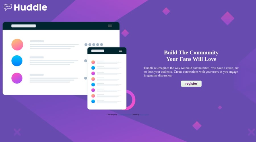
Hello friend. You did a great job in the desktop design. You just forget to add a margin-top at your document. In mobile, the element are not stacked one on another, I think it’s because of the img size (width: 100%). Also in your media query I don’t think you need a grid-template-columns if you have a grid-template-areas defined
1
Please log in to post a comment
Log in with GitHubJoin our Discord community
Join thousands of Frontend Mentor community members taking the challenges, sharing resources, helping each other, and chatting about all things front-end!
Join our Discord
