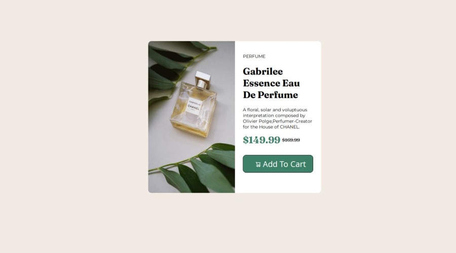
Design comparison
SolutionDesign
Community feedback
- @jyoshida93Posted 5 months ago
Hey @Sainadh7731,
Nice job on completing this challenge.
Your solution does a good job of matching the design on larger screens but I had a few tips that could make your solution even better.
- Media queries could help your layout adapt to the 1 column mobile design.
- Its generally preferred to use relative units like REMs instead of static pixel values for font sizing. REM fonts will scale based on the user's browser font sizing while px sized fonts won't.
0
Please log in to post a comment
Log in with GitHubJoin our Discord community
Join thousands of Frontend Mentor community members taking the challenges, sharing resources, helping each other, and chatting about all things front-end!
Join our Discord
