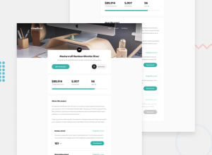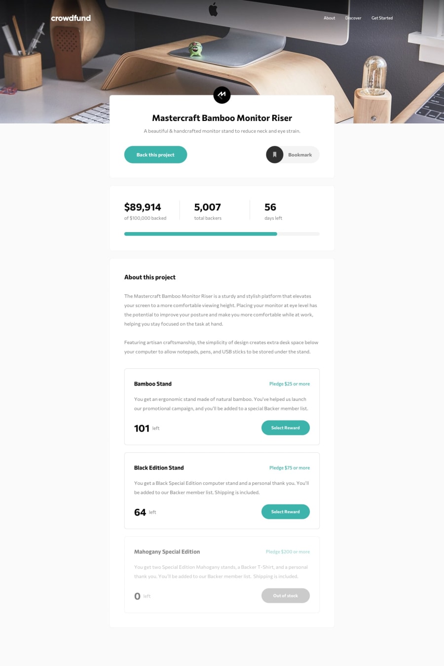
Design comparison
Solution retrospective
Hello, Frontend Mentor community! This is my solution to the Crowdfunding product page.
I appreciate all the feedback you left that helped me to improve this project. Due to the fact that I published this project very long ago, I am no longer updating it and changing its status to Public Archive on my Github.
You are free to download or use the code for reference in your projects, but I no longer update it or accept any feedback.
Thank you
Community feedback
- @dreyfus92Posted over 2 years ago
Amazing work Catherine
1 - @GHNetCodePosted over 1 year ago
Hi Catherine, Really great page you have put together, Well done! On improving your code what you could do if you wish is get the numbers adding\subtracting on the number of a particular item and also the price. This i managed to do ok via my "mobile first" solution i put together, maybe not the best way but worth a look to get an idea if you up to it. 😁
Cheers //M.
0@catherineisonlinePosted over 1 year ago@GHNetCode Thank you for the feedback. That does sound like a great idea! I usually don't try to go any further with these projects 😄
0 - @abdullah43577Posted almost 2 years ago
Hello there, great job taking on this challenge, I wanted to point out a few things as I just also completed this challenge recently.
Firstly, I like the fact that the number values count up to their expected values on the scroll. but I think, according to the challenge we were supposed to make the range div also dynamically increase when a user clicks and the pop modal appears and the user inputs a value. the input entered should be added to the number of backed amounts and also +1 should be added to the total number of backers.
Also, one final check, is to make the give the disabled div element an attribute of
cursor-not-allowedthis would be a sign for desktop users that the div isn't clickable even if it looks disabled already.Other than these few points you've done a nice job.
0 - @Raxmatillo2006Posted about 2 years ago
this is perfect, amazing
0 - @dhillman1989Posted about 2 years ago
Very clever with the animated values. Nice little touch to a well implemented project. It shows your skill and creativity at the same time. Well done.
0@catherineisonlinePosted about 2 years ago@dhillman1989 Thanks! For animation, someone from FM advised me once and it was a great experience definitely!
0 - @cyberohn2Posted over 2 years ago
i just can't wait to become like you and kevin powell, this is really nice.
0 - @didyouseekyngPosted over 2 years ago
Hey Catherine, this is a really nice work. What I would like to know is how you make the transition between different media queries stay the same. It's one thing I'm having issues with, trying to make my design stay the same when I resize my screen from 1440px down to 768px. Please how do you handle such situations?
0@catherineisonlinePosted over 2 years ago@didyouseekyng There are many different approaches and ways to do that. It also depends on how you built the project. I recommend you check out Kevin Powell on Youtube.
2 - @elaineleungPosted over 2 years ago
Hi Catherine, great work here; this is one of the challenge I wanted to tackle soon, and I'm glad to see it in action!
Just two quick comments here: About the amount input, the number spinner is visible on Firefox and also covering the value. I see in your code that you have the
appearance: noneforwebkit; you may want to add one for-mozand also a generalappearance: nonesince I don't see one at all.The other comment is, since I was looking at the CSS, I scrolled up to see whether there were resets for the inputs already, and I couldn't see any reset/normalize style rules being used at all, and no external sheets in the
<head>tags either. As a test, I added a simplebox-sizing: border-boxandmargin: 0star selector rule using the inspector, and immediately I saw things shifted. I tried the same on Chrome and got similar results. I wonder whether there's a reason for not having any reset/normalize style rules, and I'd be interested to know the decision behind that for my own learning.Great work here, will be bookmarking this! 😊
0@catherineisonlinePosted over 2 years ago@elaineleung Thanks for the feedback. I usually use reset but I totally missed it here, no specific intentions. 😁 I don't always test it a lot so seems like this time everything worked fine without test and reset. But you got some great advice, thanks.
1 - @dazzlerabhi30800Posted over 2 years ago
I loved the digit incrementing animation😁😁.
0 - @ErayBarslanPosted over 2 years ago
Hey Catherine, excellent work on the challenge! There is just a little gotcha about
background-size. Header has fixed height socontainwon't let the image grow as the screen gets wider. Everything else looks perfect, happy coding :)0@catherineisonlinePosted over 2 years ago@ErayBarslan Thank you, I will fix that
0
Please log in to post a comment
Log in with GitHubJoin our Discord community
Join thousands of Frontend Mentor community members taking the challenges, sharing resources, helping each other, and chatting about all things front-end!
Join our Discord
