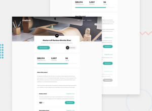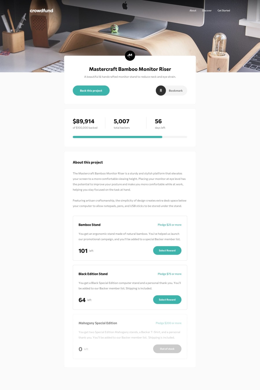
Design comparison
Solution retrospective
Hi fellows :)
This is my solution with the SASS module, CSS flexbox, and Vue.js.
I have deepened the use of SASS focusing on splitting into modules and reusing code through mixins and variables. I got more familiar with the Mobile-first approach and with the flexbox
The default part in which I face hurdles is making the custom modals for show popups but I tackle them by creating reusable components which helps me a lot secondly I managed state using Vue pinia however it's for a large project but here I gained some experience.
But I also need your comments to improve myself more please check my work and guide me
Thank you for taking the time to check out my project and happy coding!
Community feedback
- @godmayhem7Posted about 2 years ago
hello @usmanahmedkhan09 your code was totally amazing 👏👏 here are some things you missed in your code; your radio button doesn't toggle if you click it it just stay like that and also in your modal section the numbers didn't align properly and there are on the top, as a programmer it is very important to do a review on your code before submitting so you will know what part of your code needs debugging this is something that no programmer can out grow whether he/she is a beginner or a pro because it helps us know our shortcomings , the rest was okay, hope this feedback was helpful 👍👍
0@usmanahmedkhan09Posted almost 2 years ago@godmayhem7 I think you didn't check the radio button's state it toggles properly when you move between cards and try to select multiple cards
0@godmayhem7Posted almost 2 years ago@usmanahmedkhan09 it doesn't toggle when you click on it twice okay think of it like this what if some one doesn't want to click on any of the items what will they do?
0
Please log in to post a comment
Log in with GitHubJoin our Discord community
Join thousands of Frontend Mentor community members taking the challenges, sharing resources, helping each other, and chatting about all things front-end!
Join our Discord
