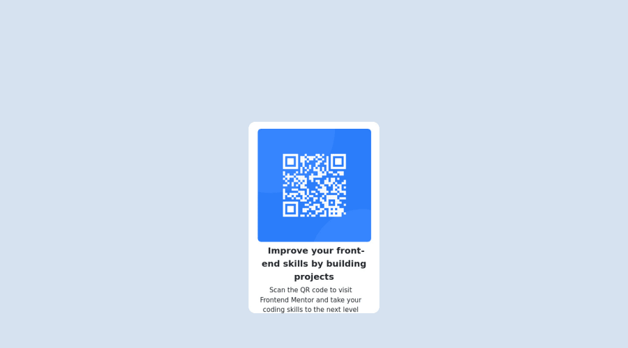
Design comparison
SolutionDesign
Community feedback
- @ecemgoPosted over 1 year ago
Some recommendations regarding your code that could be of interest to you. 🤗
In order to fix the accessibility issues:
- You need to replace
<div class="container-fluid">with the<main>tag and<div class="attribution">with the<footer>tag. You'd better use Semantic HTML, and you can also reach more information about it from [Using Semantic HTML Tags Correctly] - Each main content needs to start with an h1 element. Your accessibility report states the need for one main landmark. So, you need to use a
<h1>element in the<main>tag instead of using the<p>element. You can replace the<p id="ñ">Improve your front-end skills by building projects</p>element with the<h1 id="ñ">Improve your front-end skills by building projects</h1>element.
Hope I am helpful. :)
Marked as helpful1 - You need to replace
- @0xabdulkhaliqPosted over 1 year ago
Hello there 👋. Congratulations on successfully completing the challenge! 🎉
- I have other recommendations regarding your code that I believe will be of great interest to you.
HTML 🏷️:
- This solution generates accessibility error reports, "All page content should be contained by landmarks" is due to incorrect usage of
semanticmarkup, which causes lacking of landmark for a webpage
- So fix it by replacing the wrapper
<div class="container-fluid">element with the semantic element<main>along with<div class="attribution">into a<footer>element in yourindex.htmlfile to improve accessibility and organization of your page.
- What is meant by landmark ?, They used to define major sections of your page instead of relying on generic elements like
<div>or<span>. They are use to provide a more precise detail of the structure of our webpage to the browser or screen readers
- For example:
- The
<main>element should include all content directly related to the page's main idea, so there should only be one per page - The
<footer>typically contains information about the author of the section, copyright data or links to related documents.
- The
HEADINGS ⚠️:
- This solution has also generated accessibility error report due to lack of level-one heading
<h1>
- Every site must want at least one
h1element identifying and describing the main content of the page.
- An
h1heading provides an important navigation point for users of assistive technologies, allowing them to easily find the main content of the page.
- So we want to add a level-one heading to improve accessibility by reading aloud the heading by screen readers, you can achieve this by adding a
sr-onlyclass to hide it from visual users (it will be useful for visually impaired users)
CSS 🎨:
- let me explain, How you can easily center the component using Bootstrap.
- We don't need to use
marginandpaddingto center the component both horizontally & vertically. Because usingmarginorpaddingwill not dynamical centers our component at all states
- To properly center the component in the page, you should use
FlexboxorGridlayout. You can read more about centering in CSS here 📚.
- For this demonstration we use bootstrap's
Flexboxutility classes to center the component
<body class="vh-100 d-flex justify-content-center align-items-center">- Now you want to remove utility classes for
margin, after removing you can able to see the changes
.
I hope you find this helpful 😄 Above all, the solution you submitted is great !
Happy coding!
Marked as helpful1
Please log in to post a comment
Log in with GitHubJoin our Discord community
Join thousands of Frontend Mentor community members taking the challenges, sharing resources, helping each other, and chatting about all things front-end!
Join our Discord
