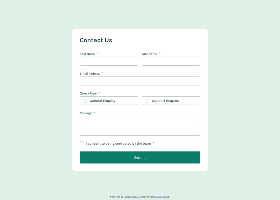


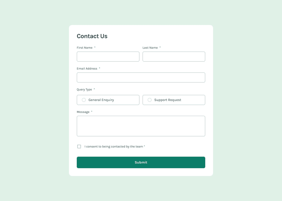
Design comparison
SolutionDesign
Community feedback
- P@YuliaLantzbergPosted 3 months ago
Hi. Good job. But there are a few bugs. First of all the form allows to submit even tho not all required fields are filled. Only name and email are enough to send the form. Also, when navigating with keyboard the radio buttons, checkbox and button are skipped or not skipped but there is no any visual sign that they are focused. Also there is no need to get. But CSS is perfect and there is semantic HTML 👍 Hope it's helpful
Marked as helpful0

Please log in to post a comment
Log in with GitHubJoin our Discord community
Join thousands of Frontend Mentor community members taking the challenges, sharing resources, helping each other, and chatting about all things front-end!
Join our Discord