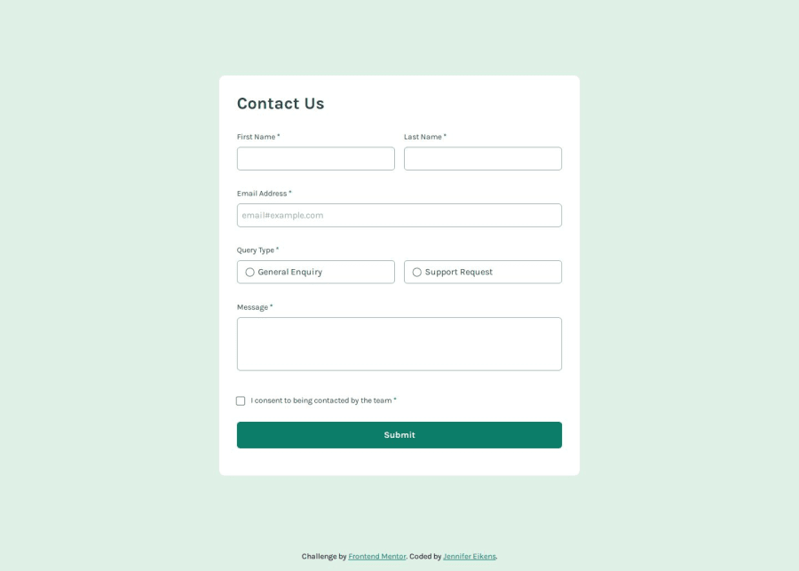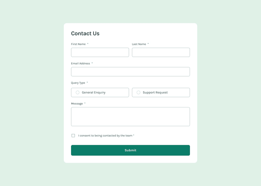
Contact form built with React and TailwindCSS
Design comparison
Solution retrospective
This is the first project where I implemented CSS grid. I tend to only use flexbox but recently I have been studying the limitations of flexbox and the advantages of grid. I have found using both flexbox as well as a grid layout very helpful for this project. This was also the first time I had to implement form validation. It was definitely a learning curve, but I do think my solution works well. As for future projects, I still have a lot to learn about using grid, so I will educate myself further and implement it in future projects. I also have a lot more learning to do regarding accessibility and the use of ARIA attributes.
What challenges did you encounter, and how did you overcome them?As I had never worked with form validation before, it took some time for me to get an understanding of the subject. I also initially struggled with the top of the page getting cut off in landscape orientation on mobile devices, but I solved that by using min-height: 100vh instead of height: 100vh for my body. I learned that apparently, browsers sometimes include the address bar in the viewport height and thus the content of the page can disappear behind it. I decided against using the custom svgs provided in the starter files in place of regular radio buttons / checkboxes in this project as I don't yet know enough about how to do this while maintaining accessibility. I plan on educating myself in this area and implementing it in future projects.
What specific areas of your project would you like help with?For some reason, on smaller screens, where the input fields take up the entire width of their grid row, there seems to be a larger margin at the bottom of the first name field than the other input fields. I can't seem to figure out why that is, so if anyone has any ideas, please go ahead.
Community feedback
- @KapteynUniversePosted 5 months ago
You have 2 gap on the name grid section
#name {
    /* grid-gap: 1rem; */
    display: grid;
    gap: 1rem;
    grid-template-columns: repeat(auto-fit, minmax(min(180px, 100%), 1fr));
}
If it is not intended, query wrap also has 1 rem of gap
1
Please log in to post a comment
Log in with GitHubJoin our Discord community
Join thousands of Frontend Mentor community members taking the challenges, sharing resources, helping each other, and chatting about all things front-end!
Join our Discord
