Conference Ticket Generator in HTML, CSS & JS


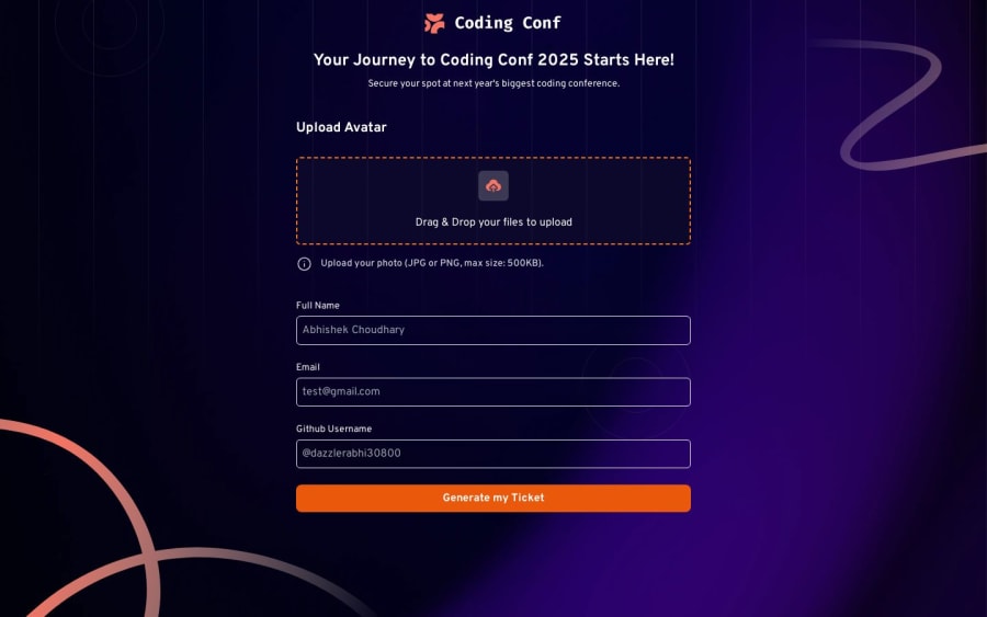
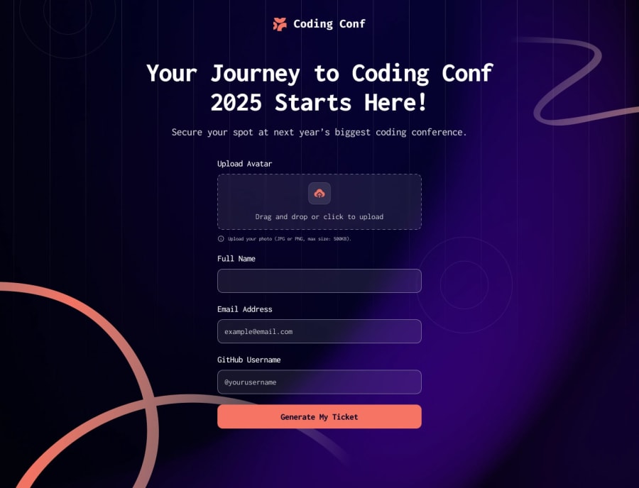
Design comparison
Community feedback
- P@maricastrocPosted about 2 months ago
Hello! I really liked your solution. At my job, my teammates don’t like adding comments to the code, but I personally like them a lot and think they contribute greatly to code readability and organization.
Here are a few small details I noticed:
On smaller resolutions, the background doesn’t fully cover the screen, leaving a white space on the right; It might be a good idea to add some bottom padding to the form’s submit button to prevent it from sticking to the bottom edge of the screen; Properly associating labels with inputs could improve usability.
Other than that, I just want to congratulate you on completing another challenge!
1

Please log in to post a comment
Log in with GitHubJoin our Discord community
Join thousands of Frontend Mentor community members taking the challenges, sharing resources, helping each other, and chatting about all things front-end!
Join our Discord