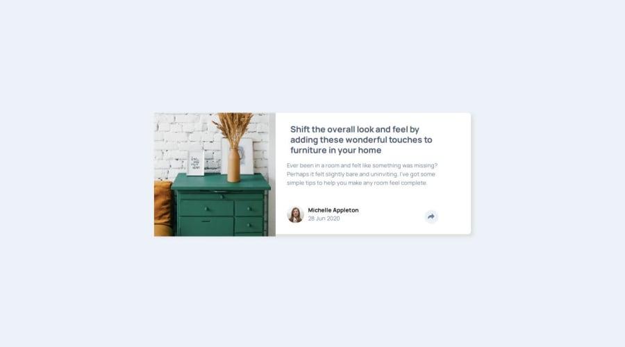
Design comparison
Solution retrospective
Again took more time then I estimated. Many complex details (background color of button changing when pressed but only in desktop version...complicated). Finally did SVG design in HTML code. Fun.
What challenges did you encounter, and how did you overcome them?Keeping focussed and going, also when small details require a lot of time.
What specific areas of your project would you like help with?I have the feeling I make CSS way to complicated. How can I do KISS ?
Community feedback
- @AdrianoEscarabotePosted 6 months ago
Hello clickglue, how are you? I was really pleased with your project, but I’d like to offer some advice that might help:
I noticed that you use more than one h1, this is not a good practice since it is recommended to have only one h1 per page to inform the main title of the page! so remove all h1 and put h2
The rest is spot on.
Hope it’s helpful to you. 👍
Marked as helpful1 - @VincinChristmasPosted 6 months ago
Ah....good effort but not quiet write. give me a chance to look at a bit more in detail later. The desktop version doesn't seem to be here and the JavaScript looks tricky. I will dive in and give you feed back soon.
0
Please log in to post a comment
Log in with GitHubJoin our Discord community
Join thousands of Frontend Mentor community members taking the challenges, sharing resources, helping each other, and chatting about all things front-end!
Join our Discord
