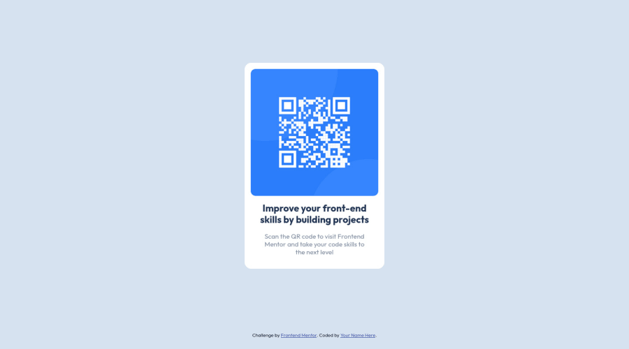
Design comparison
Solution retrospective
Great job on developing a QR code component in HTML5, CSS3, and JavaScript! Here are some questions for feedback:
- What do you think of the overall functionality of the QR code component?
- Are there any bugs or issues that need to be addressed?
- How does the component handle different types of input data?
- Is it able to generate QR codes for different types of data, such as URLs, plain text, and email addresses?
- Are there any areas of the code that you think could be improved or optimized?
- For example, is there any unnecessary duplication or inefficiency in the code?
- Have you followed best practices for accessibility and user experience?
- Is the component easy to use and navigate for all users, including those with disabilities?
- Have you considered how the component will look and function on different devices and screen sizes?
- Is it responsive and adaptable to different contexts?
- Finally, have you tested the component thoroughly to ensure it works as expected in all scenarios?
- Have you considered edge cases and unexpected inputs that might cause issues?
Community feedback
- @StephenYu2018Posted over 1 year ago
I liked the sizing of the component, image and texts. I'd also like to give a few suggestions for what you can do in the future:
alt
attribute of<img>
represents alternative text that is displayed in place of the image when the browser cannot display that image for some reason/error. A better and more descriptive alt text for the<img>
would bealt="QR code to visit Frontend Mentor"
- Prefer using
rem
measurements instead ofpx
measurements for sizing.rem
calculates its measurement off the font size of the root element (which ishtml
). The font size of the root element is dictated by the browser and can be changed by the user. While the default is16px
on most browsers, users can choose to make it larger, possibly because most text would be too small to read. By sticking withpx
measurements, you remove that capability from the user, as the text won't scale larger when the user chooses larger font sizes. Instead the text will remain the same size.- Also, do not style
html
font size usingpx
to change how the root font size appears. That also removes that feature from the user as well. If you want the root font size of your page to appear at a different size:- Use percentage units
%
- Divide your apparent root font size with the actual default root font size
- Example: If I wanted my root font size to appear at 13px instead of 16px, I would do the following calculation:
13px / 16px = 0.8125 = 81.25%
- The final CSS property would be
html { font-size: 81.25%; }
- Use percentage units
- Also, do not style
Marked as helpful2@visualdennissPosted over 1 year ago@StephenYu2018 @momin-ctg Regarding % and the 62.5% hack, i'd recommend reading this article written by Grace: https://fedmentor.dev/posts/rem-html-font-size-hack/
She talks about the negatives and cons of that % hack and offers some better alternatives.
2@momin-riyadhPosted over 1 year ago@visualdenniss I checked by put two value (62.5%, 81.25%) in my recent challenge! Yeah, both have pros and cons!!
1@StephenYu2018Posted over 1 year ago@visualdenniss It was a good read. I forgot that not all font sizes inherit and wasn't aware of the plethora of maintainability concerns this would cause. Thanks for showing me the article.
1 - @visualdennissPosted over 1 year ago
Hello there,
good work overall. Congrats.
-
height: auto; is kinda redundant as it is the default value. E.g. you gave height: auto; for the img.
-
Also avoid fixed heights like height: calc(100vh - 40px); better would be to use min-height approach.
Hope you find this feedback helpful!
Marked as helpful1 -
- @ecemgoPosted over 1 year ago
Some recommendations regarding your code that could be of interest to you.
In order to fix the accessibility issues:
- You need to replace
<div class="container">
with the<main>
tag and<div class="attribution">
with the<footer>
tag. You'd better use Semantic HTML, and you can also reach more information about it from Using Semantic HTML Tags Correctly. - Each main content needs to start with an h1 element. Your accessibility report states page should contain a level-one heading. So, you need to use a
<h1>
element in the<main>
tag instead of using<h3>
. You can replace your<h3>Improve your front-end skills by building projects</h3>
element with the<h1>Improve your front-end skills by building projects</h1>
element.
Hope I am helpful. :)
Marked as helpful1 - You need to replace
Please log in to post a comment
Log in with GitHubJoin our Discord community
Join thousands of Frontend Mentor community members taking the challenges, sharing resources, helping each other, and chatting about all things front-end!
Join our Discord