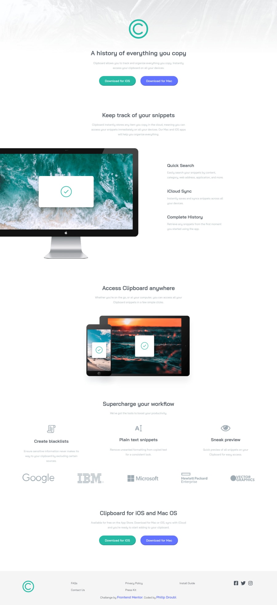
clipboard-landing-page-master with HTML & Css
Design comparison
Solution retrospective
Hey everyone 🙋♂️, this is my solution for clipboard-landing-page-master challenge, please take a look and give me your feedback. Thanks :)
Community feedback
- @emestabilloPosted over 3 years ago
Hey @Philip-Droubi, site is responsive and looks good visually. Great hover effects, maybe slow it down a bit more with 0.2s. The html can be adjusted like so for accessibility:
-
When using headings, start with h1 (like the big text in the header), and they must come in order of increasing numbers initially.
-
The 4 CTAs on the page have to be
<buttons>instead ofdivs -
Similarly, the social media icons must be enclosed in
atags since it leads the user to another page when clicked -
Use
sections to separate contents of your page in place of divs. Andul+lifor grouped information like the company logos and footer nav
Hope this helps!
Marked as helpful1 -
Please log in to post a comment
Log in with GitHubJoin our Discord community
Join thousands of Frontend Mentor community members taking the challenges, sharing resources, helping each other, and chatting about all things front-end!
Join our Discord
