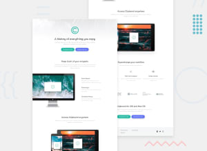
Design comparison
Solution retrospective
open for any suggestion to improve and to be better, please,
Community feedback
- @tedikoPosted over 3 years ago
Hello, Walmanjm! 👋
Good job on this one! 🎉 Your solution responds well and overall looks good. Here's my suggestions:
- Change the
altattributes for the.header-logo,.snippets-cards,.access-deviceimages, as they don't add any extra context for screen reader users. Since your images are decorative youralttext should be provided empty (alt="") so that they can be ignored by assistive technologies. - Wrap your
liitems inside.navinto anchor tag to make them clickable. - No need to add additionally
divinsideheaderorfooterelement with class "header/footer". You can add that class right away on that element.
Good luck with that, have fun coding! 💪
Marked as helpful1 - Change the
- @brasspetalsPosted over 3 years ago
Congrats on submitting another solution! Overall, you did a good job. I do have a few suggestions:
- To achieve the hover color change on the social icons, I suggest using inline svg and the fill property.
- Note that the font sizes increase for the desktop version. Here you have kept them the same as mobile.
- For the min-width: 320px & max-width: 812px media query on your header, you have a typo. Instead of
background: cover, it should bebackground-size: cover.
Marked as helpful1@walmanjmPosted over 3 years ago@brasspetals nice suggestions Anna , thanks for the link, 👍
0 - Account deleted
Good solution, but on the buttons and the icons you are missing the hover states. On mobile the buttons are too spaced out.
Keep coding.
Marked as helpful1 - @walmanjmPosted over 3 years ago
Hi guys 😊,
@thulanigamtee @palgramming @brasspetals @tedikothanks for giving me some advice, i manage to make some update based on your suggestion, if you have time please check the update : solution update
for @brasspetals i am so sorry ✌ , seems i cannot make the "inline svg and the fill property" , but instead i used "fontawesome"
0@palgrammingPosted over 3 years ago@walmanjm I think one of the main issue now is that your 5 company logos in a row are not wrapping or transitioning to the mobile layout but overflowing out the sides on the browser when mobile sized
0@walmanjmPosted over 3 years agook i will check again,
thanks Patrick for checking the solution again 👍,
0@brasspetalsPosted over 3 years ago@walmanjm Font Awesome totally works! 👍
I've noticed some odd changes with your update, which is overall good. It seems the
.workflow-listhas lost the spacing between elements on the desktop version, and the.snippets-card-listtext is now very cramped due to the width being so small (on desktop, again).For the
.logo-listyou could try addingflex-wrap: wrapto prevent the overflow that happens on some of the medium/tablet widths.0@walmanjmPosted over 3 years ago@brasspetals yes Anna you are right.
i forgot to add spacing in
.workflow-list.and the
.snippets-card-listthe width should different in desktop and mobile, (thanks again ✌😂).i try make some change in vscode and run it :
.snippets-cards-listbecomewidth: 30rem;in desktop..snippets-cards-listwidth: 18rem;stay same in mobile. its work fine i see.flex-wrap: wrapit sure help👍0
Please log in to post a comment
Log in with GitHubJoin our Discord community
Join thousands of Frontend Mentor community members taking the challenges, sharing resources, helping each other, and chatting about all things front-end!
Join our Discord
