Design comparison
Solution retrospective
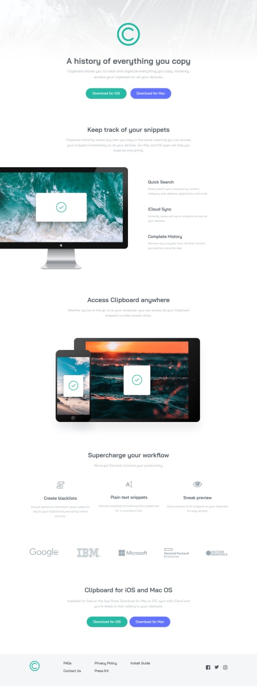
It was a great challenge. I had some struggle with trying to copy the design of the buttons. Hopefully they look the same as the design now.
Community feedback
- @skyv26Posted over 1 year ago
Hi @Jolijn0101,
Great work, your design is impressive and also responsive throughout the devices. As I saw that you followed and use the correct semantics but not completely. Like look at below code
<ul> <div> <li>FAQs</li> <li>Contact Us</li> </div> <div> <li>Privacy Policy</li> <li>Press Kit</li> </div> <div> <li>Install Guide</li> </div> </ul>
you can actually use
nested-list
and make your code look like this:<ul> <li> <ul> <li>FAQs</li> <li>Contact Us</li> </ul> </li> .... ...... ... </ul>
Overall, really nice work.
Marked as helpful0@Jolijn0101Posted over 1 year agoHi @skyv26, Thank you for your compliments about my work and for the great feedback. The info about the nested-list was very helpful and I rewrote my code. Now it has les errors :)
1@skyv26Posted over 1 year ago@Jolijn0101 You are welcome. I am happy to hear that my feedback worked for you.
1
Please log in to post a comment
Log in with GitHubJoin our Discord community
Join thousands of Frontend Mentor community members taking the challenges, sharing resources, helping each other, and chatting about all things front-end!
Join our Discord