Design comparison
SolutionDesign
Solution retrospective
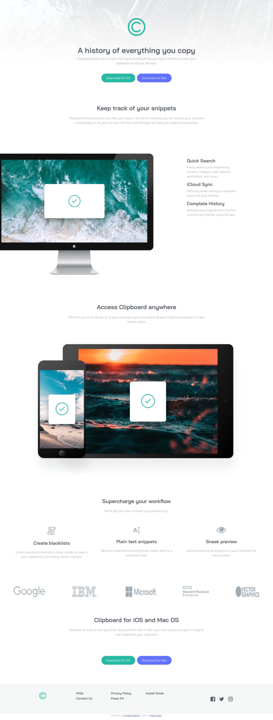
suggestions are welcomed . please comment on the improvement of responsive part .
Community feedback
- @tedikoPosted over 3 years ago
Hello, Mansi! 👋
Good job on this one! Your solution responds well and overall looks good. In addition to great APG feedback here's my suggestions:
- Change the
altattributes for the.top-containerlogo,.tracking_imgimage,.devicesimage.col-lg-4icons, as they don't add any extra context for screen reader users. Since your images are decorative youralttext should be provided empty (alt="") so that they can be ignored by assistive technologies. - You forgot to remove
margin-rightfrom.bt-ioson mobile screen size and this causes that buttons aren't aligned.
Good luck with that, have fun coding! 💪
1 - Change the
- @ApplePieGiraffePosted over 3 years ago
Hey there, mansi! 👋
Well done on this challenge! 👍 Your solution looks pretty good! 🙌
A few things I'd like to suggest are,
- Making sure the logos in the logo section towards the bottom of the page don't get squeezed or stretched when the size of the screen changes but maintain their aspect ratio so that they look good.
- Turning the navigation links in the footer of the page into actual links by wrapping them in anchor tags. Giving them a hover state would be a good idea, too.
- Adding
background-size: coverto the CSS background image in the header of the page so that it covers the entire length of the screen even on extra-large screens.
Hope those few tips help a little. 😀
Keep coding (and happy coding, too)! 😁
1
Please log in to post a comment
Log in with GitHubJoin our Discord community
Join thousands of Frontend Mentor community members taking the challenges, sharing resources, helping each other, and chatting about all things front-end!
Join our Discord
