

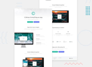
Design comparison

Solution retrospective
HI, I still have problems for responsive websites. When i am changing view width my projecy staring to look bad. Any tips for that?
Community feedback
- @IryDevPosted about 1 year ago
Hey @Rahuene your solution looks good on desktop😄
I have some advice in order to make your solution better and responsive :
-
Use Media Queries: Media Queries are CSS instructions that allow you to define specific styles based on screen width. Use them to adjust margins, paddings, font sizes, and other properties based on device size.
-
Test on Different Screen Sizes: Be sure to test your site on a variety of resolutions, including desktop screens, tablets, and smartphones. Browser dev tools allow you to simulate different screen sizes to see how your site responds.
-
Use Relative Units: Prefer the use of relative units like percentages, ems and rems rather than fixed units like pixels. This will allow your elements to adapt according to the screen size.
-
Prioritize Content: Consider using the “mobile-first” technique, where you first design for mobile screens and then add styles for larger screens. This ensures that your content is always readable and well-presented on mobile devices.
-
Image Fluidity: Use images with a maximum width of 100% so that they automatically adjust to the width of their container. This will prevent the images from protruding from their defined space.
-
Test Interactive Elements: Make sure buttons, links, and forms are easily clickable and interactive on all types of devices. Keep finger sizes in mind for touch devices.
-
Use Flexbox and Grid Layout: The Flexbox and Grid Layout layout methods provide precise control over the layout of your elements. Use them to organize your content in a flexible and consistent way.
I hope you'll find this helpful😄
0 -

Please log in to post a comment
Log in with GitHub
Join our Discord community
Join thousands of Frontend Mentor community members taking the challenges, sharing resources, helping each other, and chatting about all things front-end!
Join our Discord