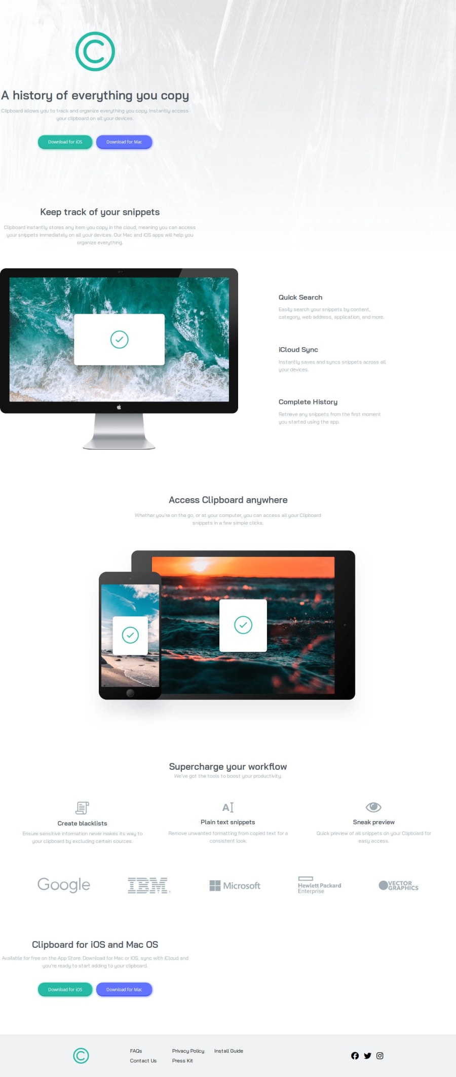
Design comparison
Solution retrospective
Any feedback appricated. Thanks.
Community feedback
- @dylan-dot-cPosted 5 months ago
Looking good and responsive as well!
I see that you have used
idsalmost everywhere in your HTML code, for design purposes it better to use classes where I think it's generally accepted as abest practiceand ids are normally for form control or for using js. Even if it might not seem reusable, still use classes. I actually had that habit when starting out and chose now to use classes for styling and ids for javascript dom manipulation.Also the div you have
#computer-content-containeris a flex container but it isn't aligned center on larger screens as it stays on the left while the rest stays centered. You can just make itjustify-content: centerand you should be good.You can also translate the image a bit to the left to offset it a little from the webpage.
Other than those you did well, great work!
2@erntTt94Posted 5 months ago@dylan-dot-c Thank you, i'm using ids when i need to separate an element and classes when i need styles on many elements, but yes i made many ids here insted of clases which i need to work on... Oh for #computer-content-container it needs to be on the left side like in the design.. Thank you very much.
0@dylan-dot-cPosted 5 months ago@erntTt94 okl, but I still suggest that you could add a max-width as if you zoom out on it, everything will be centered but that container will be far on the left, so a max-width can fix that.
1
Please log in to post a comment
Log in with GitHubJoin our Discord community
Join thousands of Frontend Mentor community members taking the challenges, sharing resources, helping each other, and chatting about all things front-end!
Join our Discord
