Submitted about 4 years agoA solution to the Chat app CSS illustration challenge
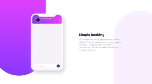
Chat App UI done with only CSS (no images included)
@dusanlukic404

Solution retrospective
Very competitive challenge. 📲 💻 I would appreciate every feedback or recommendation. 😄 I made some animations for messages. 💬 Highly recommending this challenge for all developers who wants to learn more about pseudo elements and positioning in CSS3. 🧐
Code
Loading...
Please log in to post a comment
Log in with GitHubCommunity feedback
No feedback yet. Be the first to give feedback on Dušan Lukić's solution.
Join our Discord community
Join thousands of Frontend Mentor community members taking the challenges, sharing resources, helping each other, and chatting about all things front-end!
Join our Discord