Not Found
Not Found
Not Found
Not Found
Not Found
Not Found
Not Found
Not Found
Not Found
Not Found
Not Found
Not Found
Not Found
Not Found
Not Found
Not Found
Not Found
Not Found
Not Found
Not Found

Submitted

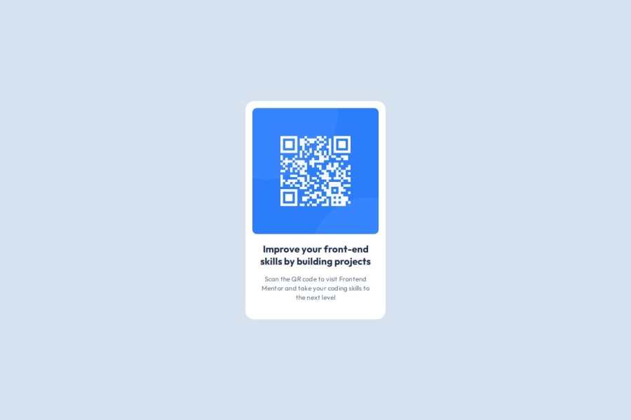
Centered QR component using css flexbox

@Joliot-TSIMISARAKA

Desktop design screenshot for the QR code component coding challenge

This is a solution for...

  • HTML
  • CSS
1newbie
View challenge

Design comparison


SolutionDesign

Solution retrospective


What are you most proud of, and what would you do differently next time?

I'm not particularly proud of any particular section of my code as I'm still far away from being proficient enough to be confident in css. But I hope that for the upcoming projects, my code will be clean and concise enough

What challenges did you encounter, and how did you overcome them?

The real challenges that I encounter was when I tried to combine margin and padding around the element in order to get the correct result. There is also git and github, topics I haven't touched upon before

What specific areas of your project would you like help with?

Writing better and cleaner css code as to avoid repeated element calls

Community feedback

P
Steven Stroud 4,100

@Stroudy

Posted

Good job with matching up visually with the exact solution, In your CSS try not to use px instead use rem or em but mostly you will use rem. You can use a PX to REM converter to make it easier for you. Using a responsive unit like REM will make your site more responsive for all screen sizes. Using max-width: 100% or min-width: 100% will always be better then just using a normal width: 100% and more responsive. Responsive Meaning is a good read by a Frontend-mentor dev to help you grasp the idea.

Marked as helpful

0

@Joliot-TSIMISARAKA

Posted

@Stroudy Thank you very much, I will definitely read the article and dive deeper into responsive design techniques, I'm still quite clueless about when to apply "min-width" and "max-width" in css too. I'm already starting to use "em" and "rem" when dealing with font-sizes, but should I also use them in padding and margin ?

1
P
Steven Stroud 4,100

@Stroudy

Posted

@Joliot-TSIMISARAKA Yes I use rem for padding and margin because when you view it on different screen sizes it will scale proportionally. I thought I knew a lot about responsive web design turns out I did not, This is why i want to share this information with you :D

Marked as helpful

0

@Joliot-TSIMISARAKA

Posted

@Stroudy Thank you again ! Put simply, it's always better to use relative units when having responsive design in mind, I'll try integrating that practice from now onwards

1
P
Steven Stroud 4,100

@Stroudy

Posted

@Joliot-TSIMISARAKA, No problem at all, I'm happy to help and if you have any more questions I'm happy to answer, Happy Coding!

0

@Gingerlox

Posted

Looks really good! Almost perfectly sized to fir the design!

I see you have issues on how to best deal with padding and margin. Now I'm no pro, but how I think about it is this:

  • Use padding for borders and styling e.g making an <a> look like a button.

-Use margin for layout stuff, like creating space between elements and centering.

Marked as helpful

0

@Joliot-TSIMISARAKA

Posted

@Gingerlox Really helpful tips ! I always tend to forget about the proper box model design when the borders and the paddings of the element are not that obvious.

1

Please log in to post a comment

Log in with GitHub
Discord logo

Join our Discord community

Join thousands of Frontend Mentor community members taking the challenges, sharing resources, helping each other, and chatting about all things front-end!

Join our Discord