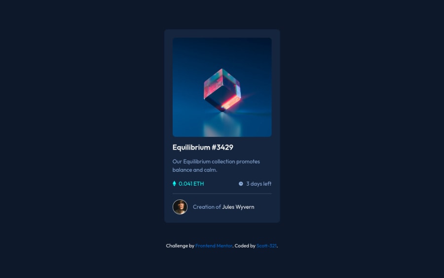
Card with image using flex box and absolute positioning.
Design comparison
Solution retrospective
I found overlaying the image, semi transparent solid colour and icon, the hardest part. I really enjoyed playing with absolute positioning and z-index to achieve the effect.
It would be great to have some feed back on this part in particular - If there is a better way to achieve the same result.
Thanks,
Scott
Community feedback
- @godmayhem7Posted about 2 years ago
wow your code is absolutely amazing here is some hint on how to better your code you should have increased the height of the body like( body{ height:120vh}) and also don't just put divs in the main section also make use of the section tag (<section></section>) and also at the end of your html document you should have a footer tag ( <footer></footer>) dont just leave it as the default tag as used when you started the challenge i hope my feedback was helpful 👌
1@Scott-321Posted about 2 years ago@godmayhem7
Thank you so much for the feedback. I will have a play with my code and experiment with the body height 👍 Great tip about using semantic elements. I will definitely incorporate them in the next project.
0
Please log in to post a comment
Log in with GitHubJoin our Discord community
Join thousands of Frontend Mentor community members taking the challenges, sharing resources, helping each other, and chatting about all things front-end!
Join our Discord
