Calculator - Mobile first, Sass, BEM, Webpack, vanilla-picker
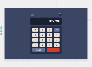
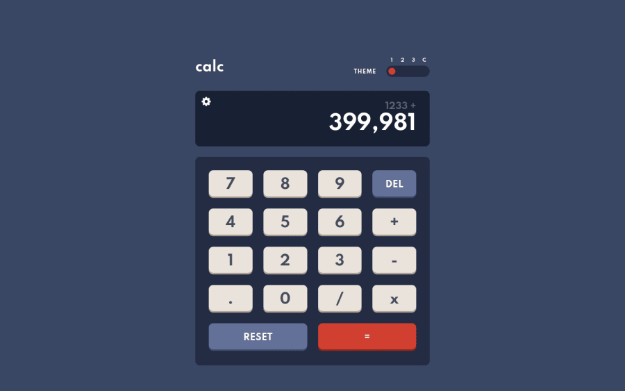
Design comparison
Solution retrospective
Helloπ!
It was one of the most enjoyable challenges I have done so far. When I saw that challenge requires a change theme I decided to add another functionality which is extra "custom" theme where the user can edit freely colors in theme modal. Many times, when I finished a certain function, I had an idea with another one, and I had a lot of fun doing it. Honestly, It took me more time to made this custom modal than the calculator itself - which itself was a good javascript challenge as well. You can use both the keyboard and the mouse to enter data into the calculator. List of things I learned or used creating this project:
- Added customizable settings for 4th theme. User selected colors are saved in Local Storage so the settings are saved and loaded when the user will come back to the site. The user can set 13 options, but he doesn't have to change all of them, he can only change those that interest him. To get the color from user I used vanilla-picker library which creates a color palette from which to choose. Palette always show current set color of element you want to change so it is easy to adjust colors back and forth without searching for that color again.
- Added prefers-color-scheme CSS media feature which is used to detect if the user has requested a light or dark color theme and save it to Local Storage. I made it with window interface
matchMedia()
method. It returns a newMediaQueryList object
that can then be used to determine if the document matches the media query string. In this case prefers-color-scheme. Read more(1). How to detect user prefered theme in JS(2). - Implemented focus trap inside modal to make it ADA compliant. Focus trap in short prevent our focus go outside the modal once the modal is opened. Read more.
- While displaying the result, I used
toLocaleString()
method to return a string with a language-sensitive representation of this number. In short it convert 3500 to 3,500 if in U.S. Read more. - I tried to make my comments more readable and transparent. For this purpose, I used JavaScript description comments which are equivalent to Python docstring. If you precede your function definitions with a description comment, VSCode will pick it up and include it as a tooltip. Itβs like having MDN right there in your editor. Read more.
- I used
object literals
instead ofif statement
in several cases. Shortly, we have an object where the keys are the conditions and the values are the responses. Then we can use the square bracket notation to select the correct value of the object from the argument passed in. This looks clean and I will definitely continue to use this. Read More. - Of the things that are invisible at first glance, the calculator returns a error message after the user divides by zero and also after you calculate one result you can click/input equal button again and it will perform same operation again. For example 2+2=4 and another click will be 6 since result our previous equation was 4 and our last input was 2 so 4+2=6.
You can find more about the things I used in the project in the README on github. I just wanted to point out new things here.
Special thanks to @brasspetals for tossing an idea with the focus trap which she used in her project. No specific questions here but any additional feedback will be appreciated! Let me know if you spot any bugs. I know they're hiding somewhere! π
Thanks! π
Community feedback
- @brasspetalsPosted over 3 years ago
Yet again an incredible job! π The keyboard accessibility is awesome, and the custom theme picker is so cool! I also really appreciate how helpful and packed full of resouces your README is!
π΅οΈββοΈ I did some serious hunting and can only come up with two minor suggestions.
- A "reset to defaults" type of button would be nice on the theme settings modal. (Excellent job on the modal focus trap, btw).
- If
calc__display-value--previous
is emptycalc__display-value--current
shifts upward. I think design wise, it'd be best if the current number always kept the same position.
2P@tedikoPosted over 3 years ago@brasspetals Thank you Anna for great feedback! Not gonna lie I forgot about the reset button for theme. It really would be pain in the neck to change them all after taking a fun experimenting different colors. π There is not much room for third button on mobile, not sure how to approach this. What would you say for having 3 icons on mobile like reset icon, save icon, close icon and then on 480px or tablet 769px it would be button for each reset and save and then icon for close like it is now.
UPDATE: Reset button has been added to the project. π
UPDATE2: Fixed a bug where
calc__display-value--current
shifts upward when--previous
was empty.1@brasspetalsPosted over 3 years ago@tediko Just checked it out - the reset functionality is great! The icons for mobile was an excellent idea, and executed really well! π The only small thing I noticed upon reset is that the custom theme resets, but if you open up the color picker, the colors are still set to the custom colors before reset. Maybe this is intentional?
Display bug is also all fixed, making the calculator even more "seamless". π―π
1P@tedikoPosted over 3 years ago@brasspetals It wasn't intentional π It is fixed now. Thank you for your feedback Anna!
0 - P@dwhensonPosted over 3 years ago
Amazing work again @tediko!! I really like what you did with this one! Iβm having a good look at your repos too as Iβm thinking I need to switch my overall approach now Iβve mostly got the basics of html and css sorted to something more like what you are doing with these challenges
I.e. taking them on and really using them as a way of exploring and pushing things further, rather than a check list to get through!
1P@tedikoPosted over 3 years ago@dwhenson Thank you. It is not possible to create something extra with every project because there's really not much room for that with landing pages for example but I think challenges like this, when you can add some extra functionality to learn more is a good approach - atleast for me. Good luck! :)
0 - @ApplePieGiraffePosted over 3 years ago
Hey, tediko! π
This solution is just amazing! π The calculator functions really well and looks great and I love the extra colors preference menu that you added! π And it's especially cool that you did all this with good ol' vanilla JS (and webpack, I suppose)! π
I took a look at your code and I really like itβI think it's very readable and makes a lot of sense. I've bookmarked this solution (and the last one, too)! π
You've also been giving so much great feedback latelyβkeep that up, as well! π
And of courseβkeep coding (and happy coding, too)! π
1P@tedikoPosted over 3 years ago@ApplePieGiraffe Thank you very much for your feedback! I am happy that you like it π I am trying to feel more comfortably with vanilla JS before I hop into frameworks and libraries. Hope you find something helpful in my code π Have a good one, APG π (I replied in the whole thread by accident haha)
1@ApplePieGiraffePosted over 3 years ago@tediko
LOL, I saw that! π Have a good one, too! π
0 - @darenhuaPosted over 3 years ago
I absolutely love your work here. As a beginner, I've been intensely reading your github repo code, and there are just so many wonderful techniques. Just from reading, I learned so much about how to organize and break sass/css files into many (with layout, base, util folders...), niche things like aria-label, a resets.css/sass file... and a LOT more. Thank you for your wonderful work and documentation.
I have only been exposed to the tip of the iceberg of development- with a cookie-cutter code structure of one big "styles.css" file and one big "script.js" file, and I desperately want to write code that is more organized and can scale more neatly. If possible, could you explain a little the purpose of the div with the class "overlay", that you included before the calculator div? Also, I would greatly appreciate a little breakdown of how you personally tackle the task of splitting your sass files. As far as my beginner analysis goes: base is the folder for "initializing" sass files- like initiliazing with margin resets or font family
component is for any "component" styles, like modals or other popups that are normally hidden and not a part of the main webpage
layout is where the main webpage layout happens- for styles like changing display:, width/heights, padding/margins, position, etc... making the webpage layout properly
and utilities is for helper files with variables, animations, etc that are used in the main style files?
At the moment, I am also confused on where things like element background colors, things like font size of the text on the keypad keys, or even the background color of the body. Surprisingly for me, I can't find any style like
body{ background = blue; }
in the code haha! I'd love to hear any feedback on how I could get to the level you are at, or any tips/resources to getting to write more professional-feeling code.
Thank you so much!!!
1P@tedikoPosted over 3 years ago@darenhua Thank you very much, it means a lot! As you well know learning the front-end web development is a long journey, so it is important to take one step at the time. What I'm trying to say is that I learn something new from each project, this is the best way to approach it in my opinion.
Answering your first question. The purpose of the
.overlay
element is quite straight forward. It is usingposition: fixed
and is stretched to take fullwidth
andheight
of my page. The overlay has abackground
color ofrgba(0, 0, 0, 0.7)
to create the effect of darkening. By default.overlay
is hidden withvisibility: hidden
andopacity: 0
but I make it visible when my theme-modal is open. This way (in this case, it's hard to notice because there is no visible content behind the modal) my modal is specified and clearly visible while my background is darkened.In response to the next question about my Sass files management. It is called partials/modules. This is a great way to modularize your CSS and help keep things easier to maintain. You can create partial Sass files that contain little snippets of CSS that you can include in other Sass files. In word, it's all about having everything in order so it is easier to work with code. To create this file structure, take a look at this Sass 7-1 Pattern which is self-explanatory. Kevin Powell tutorial about partials
Last but not least. My
background-color
is set in component-wrapper but it is taking a value from variables. As you can see, my variables are assigned to regular CSS variables from theme-colors. This is because we can't dynamically change Sass variables. Sass is a pre-processor for CSS that makes it easier to write your style rules during development. The browser will not load .sass files; it will load CSS -- so your .scss/.sass must be converted to CSS for the browser. Your Sass variables are only variables in your Sass files. Once converted into CSS, the variables will be replaced with the values they represented at the time of compilation.My best advice is to create projects and try to learn something new in each of them. Write your code, and if you get stuck, google your problems. Good luck!
1@darenhuaPosted over 3 years ago@tediko Thank you so much for the quick and in-depth response. The sass patterns guide is very helpful! I will take your advice to heart- I'll make projects and work hard!
0 - @Dinesh1042Posted over 3 years ago
Great Work on this challenge the calculator looks awesome.π I really liked the way of OOP in your code and I have learned something new from that. and Awesome work custom color selection.
Happy Coding!πͺ
1P@tedikoPosted over 3 years ago@Dinesh1042 Thank you very much! It means a lot :) Also, congratulations on being featured in Newsletter Vol.55!
1 - @MojtabaMosaviPosted over 3 years ago
@tediko Great work, looks really nice. I specially liked your way of writing OOP(js), I would really aprreciate it if you could if you mention the learning resources you used in the beginning of your Js journey.
Happy coding :)
1P@tedikoPosted over 3 years ago@MojtabaMosavi Thank you for kind words! I would love to point you every resource that I used in my learning process so far but there's not really much tutorial/course that I go throught. I remember that I started with FreeCodeCamp JavaScript Algorithms and Data Structures, then I finished JavaScript 30 from WesBos and it was really it. From that point my learning was from creating projects, trial and error. In every project I try to finish JS writing my own code, and then when something is not working iI google it and learn from that. I'm sorry that I didn't help you much.
0@MojtabaMosaviPosted over 3 years ago@tediko Actually it does help a lot, thank you for sharing :).
0 - @p-alexPosted over 3 years ago
Well done @tediko! The color configuration feature was a great idea. Amazing project!
1 - P@Skyz03Posted over 3 years ago
@tediko Nice work Man, Really love your custom theme idea. You are quite an inspiration. Keep up the good Work ! Your projects are really amazing to source of learning as well. I am surely gonna bookmark this. Thanks.
1P@tedikoPosted over 3 years ago@Skyz03 Thanks for your feedback. I am glad that my work can be inspiring for someone. I hope you will learn something from this project as you review it. Thanks, again!
1 - @RahulKumarGautam1636Posted over 3 years ago
This is really amazing idea, one more great work from you as usual.
1P@tedikoPosted over 3 years ago@RahulKumarGautam1636 Thank you! Looking forward to your next solution too π
1 - @mattstuddertPosted over 3 years ago
Another incredible solution, tediko!! π―
I absolutely love the added detail of the colour configuration modal as a fourth option. Nice work making the modal trap focus as well. Great to see you taking accessibility into consideration with each project you create.
Keep up the amazing work! π
1P@tedikoPosted over 3 years ago@mattstuddert Thanks for the kind words! The idea with a customizable theme came to me as soon as I saw a challenge on slack. π I wanted to do something similar for a long time, but there was no opportunity for it in other projects.
A little thing that I found is that design screenshot from comparison is dark and since we're using
prefers-color-scheme
in our project the screenshot from our solution is "light" since this "screenshot saver" that site use to generate screenshot doesn't have set dark mode. I had to disable prefers-color-scheme function for a moment to take a screenshot and then restore it π Not a big deal but it is better if there are same colors compared.1@mattstuddertPosted over 3 years ago@tediko, that's a good point about the
prefers-color-scheme
query and something to consider in the future. I'll think about anything we could do to improve how that works with the screenshots.1
Please log in to post a comment
Log in with GitHubJoin our Discord community
Join thousands of Frontend Mentor community members taking the challenges, sharing resources, helping each other, and chatting about all things front-end!
Join our Discord