Design comparison
SolutionDesign
Solution retrospective
Hello,
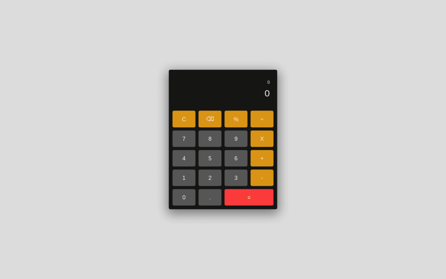
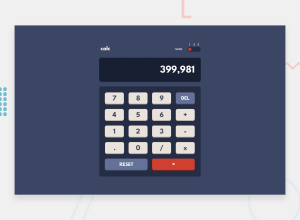
Here's my plain calculator, I didn't go for the original design because I think it's really bad and I wanted to do it more for the logical side of it, not really the looks. It's pretty simple, no theme switch or anything.
It does the basic calculations and the user is also able to use the key board to type in the numbers.
Community feedback
Please log in to post a comment
Log in with GitHubJoin our Discord community
Join thousands of Frontend Mentor community members taking the challenges, sharing resources, helping each other, and chatting about all things front-end!
Join our Discord
