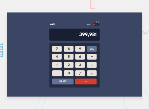
Design comparison
Solution retrospective
any feedbacks are very welcome
they help me so much
thanks in advance 🙏
Community feedback
- P@tedikoPosted over 3 years ago
Hello, Karim! 👋
Congratulations on finishing another challenge! Good job! You have to add some conditional statements since I can put multiple math signs
** -- ++and then calculator doesn't work. Also, make your whole.togglediv clickable.Good luck with that, have fun coding! 💪
1 - P@palgrammingPosted over 3 years ago
well you have a good start but still have areas to improve
1...... you should not be able to enter 3.......4...... 2. the results text should really be on the right not the left 3. it is missing the theme color changes 4. adding keyboard input would be nice
it is not a easy project I am still trying to refine mine so I have not uploaded a solution yet. I deleted 220 lines of code the other day in one part of the JS to start over. Get a real calculator and enter things in it and then yours and see how they both behave
1 - @RahulKumarGautam1636Posted over 3 years ago
Very nice, but the buttons have no pressing animation, use translateY with disappearing box shadows when user clicks the button to bring the pressing effect and the code for calculations needs rectification as it is freezing and throwing errors.
1
Please log in to post a comment
Log in with GitHubJoin our Discord community
Join thousands of Frontend Mentor community members taking the challenges, sharing resources, helping each other, and chatting about all things front-end!
Join our Discord
