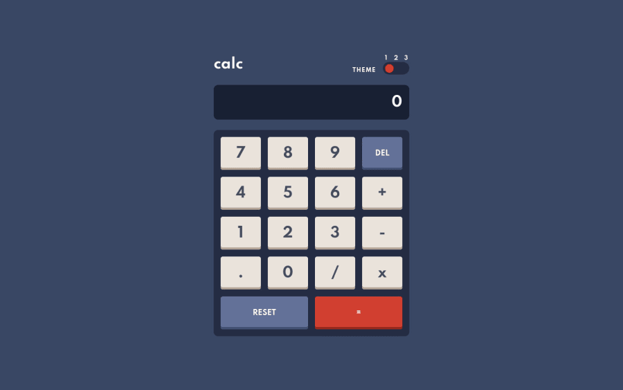
Design comparison
Solution retrospective
Let me know if you find any bugs! I spent quite a bit of time trying to squash bugs in the calculator but I'm sure I missed some.
Community feedback
- @palgrammingPosted over 3 years ago
Your buttons are great that is how I have mine in the one I am working on. They have great motion
Well the main thing you should go back and add is Keyboard inputs
1@james-work-accountPosted over 3 years ago@palgramming Thanks!
Wow I didn't even consider adding keyboard inputs, that's a great idea.
0 - @emestabilloPosted over 3 years ago
Hey James, congrats on your submission. Viewing only on mobile here, and I’m getting quite a bit of overflow. Also, when I click one of the symbols (like +, -), the initial digit doesn’t persist. I get a zero in its place instead. Calculation seems correct though 🙂
1@james-work-accountPosted over 3 years ago@emestabillo Thank you for your feedback! Wiping to 0 when the user presses one of the symbols was an intentional decision; when I wrote it like that I couldn't work out a simpler way to stop it appending to what was already on the screen. Happy to change it if it doesn't make sense from a UX perspective 🙂
What do you mean by overflow? Are the buttons not responsive to screen size or something? Admittedly I didn't check it on my actual phone yet, I just used the minimum width of the demo image 😬
1@emestabilloPosted over 3 years ago@james-work-account Just checked on desktop, looks ok when you toggle device. I get the overflow on ios, both on Safari and Chrome.
1@james-work-accountPosted over 3 years ago@emestabillo iOS is the bane of my frontend existence... I'll work on fixing it, thanks!
1
Please log in to post a comment
Log in with GitHubJoin our Discord community
Join thousands of Frontend Mentor community members taking the challenges, sharing resources, helping each other, and chatting about all things front-end!
Join our Discord
