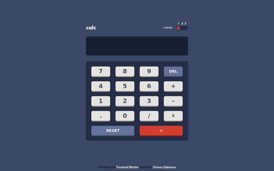
Design comparison
Solution retrospective
Wheeuu😤, this was an exciting but hard one, I got to conquer it in my own way. It was a great learning experience learning this🎉... Any feedback is welcomed🙇🏿♂️
Please log in to post a comment
Log in with GitHubCommunity feedback
- Account deleted
Good job! You can give
cursor: pointerto the buttons if you want to. I think it would feel better.Marked as helpful - @superschooler
Great job on this, Chisom!
With the style, I noticed the responsiveness is lacking a bit between about 600 & 900px. I might suggest changing the media query to change at a larger screen size or add a min-padding style to the buttons on the desktop style.
As far as the functionality goes, it works great with a single calculation but you can't string calculations together unless you're using the same symbol. For example, if I press "2+3-1" the minus sign will erase the screen and start it over, similar to clicking reset. I'm not sure how much more work you want to put into this project, but perhaps you could create a new variable to store the current calculation when those buttons are clicked and then return it before the symbol the user presses.
If you need any help with that let me know!
Marked as helpful
Join our Discord community
Join thousands of Frontend Mentor community members taking the challenges, sharing resources, helping each other, and chatting about all things front-end!
Join our Discord
