Design comparison
SolutionDesign
Solution retrospective
This was a fun project. I hope you guys like my solution. If you have suggestion please tell me I'd love to hear them.
Community feedback
- @alQaisiPosted over 2 years ago
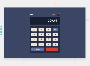
Hi Atharv :) you did such a nice thing! To fix accessibility issues just wrap your element into main tag. If you want to improve your solution just try to add an element that contains the previous number with the current math operation so the user knows the numbers and the operation. Last thing try to make buttons smaller so they get closer to the original design. Have a nice day.
Marked as helpful1
Please log in to post a comment
Log in with GitHubJoin our Discord community
Join thousands of Frontend Mentor community members taking the challenges, sharing resources, helping each other, and chatting about all things front-end!
Join our Discord
