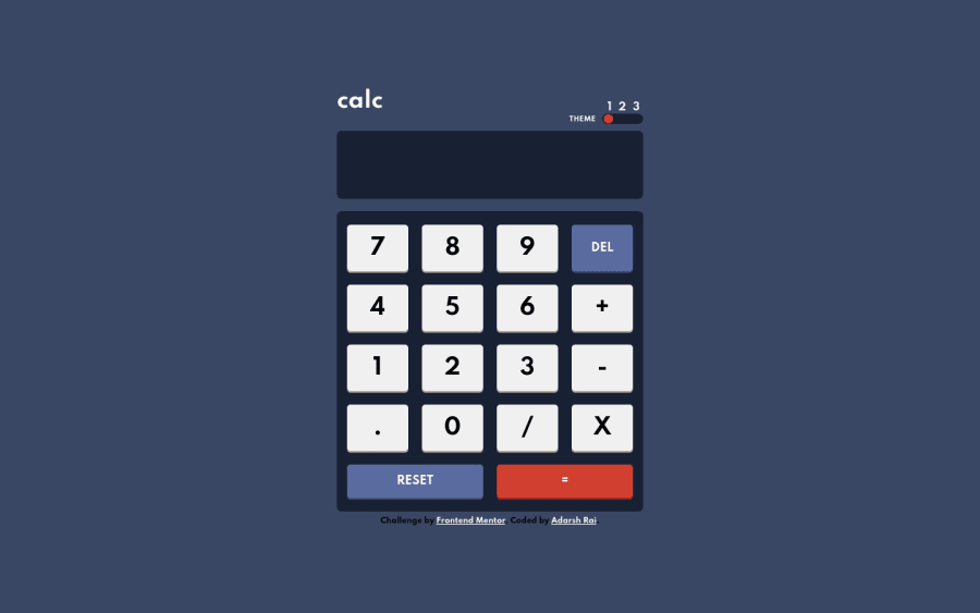
Design comparison
Solution retrospective
Hey guys!
I'm back with another little Frontend Mentor challenge.. Since I took quite a long break from coding, I wanted to warm up with a more reasonable project, but I also wanted to keep it fun and interesting.
Working with different aspects of SCSS to make this project responsive was fun and I got the chance to play some more with mixin and best practices.
So, this was today's project. I recommend you try it out and I can't wait to see your solutions.
What would've you done differently?
Let me know what you think about this solution! ;)
Community feedback
- @skyv26Posted almost 3 years ago
To solve accessibility issues:
-
wrap everything in your body in <main> OR give role="" to the direct children of your <body> ... Click here to read more here
-
<a> should have an aria-label ... Click here to read more here
-
Change your below code
<div class="attribution">
      Challenge by
      <a href="https://www.frontendmentor.io?ref=challenge" target="_blank">Frontend Mentor</a>. Coded by <a href="https://twitter.com/adarshrai00">Adarsh Rai</a>.
    </div>
TO
<footer class="attribution">
      Challenge by
      <a href="https://www.frontendmentor.io?ref=challenge" target="_blank">Frontend Mentor</a>. Coded by <a href="https://twitter.com/adarshrai00">Adarsh Rai</a>.
    </footer>
Good Luck ;)
1 -
Please log in to post a comment
Log in with GitHubJoin our Discord community
Join thousands of Frontend Mentor community members taking the challenges, sharing resources, helping each other, and chatting about all things front-end!
Join our Discord
