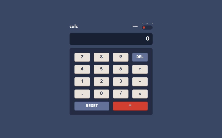
Design comparison
SolutionDesign
Solution retrospective
- took me a while to get it decently
- haven't find any bugs, hope it's favorable
Feedback/tips/comments appreciated
Community feedback
- @manuviknPosted about 1 year ago
Hi! Great job! The design is very clear and responsive. I have just two suggestions:
You can achieve smoother animations when switching by using a custom box with a position: relative and modifying only the left property of its inner element. This inner element should also have a transition property.
Another point to note is that when you divide 0 by 0, you get NaN.
Marked as helpful1
Please log in to post a comment
Log in with GitHubJoin our Discord community
Join thousands of Frontend Mentor community members taking the challenges, sharing resources, helping each other, and chatting about all things front-end!
Join our Discord
