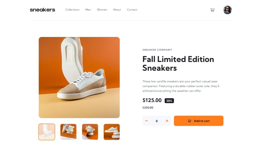
Design comparison
Solution retrospective
Yikes, it took me a whole month to complete this challenge. I tried to follow the Atomic Design principles but I feel like there is still a lot do work on. If you have any suggestions/feedback, I'll appreciate it. Thx!!!
Community feedback
- @skyv26Posted almost 3 years ago
First of all, Really nice work..
You can improve your design more. Like when we click on cart button, then gary colored box highlight appears on clicking,
You can use
-webkit-highlight property can be easily find on Google , helps to remove this problem.
Why you have apply condition not more than 5, it is ok that you did it intentionally but user experience matters alot. Finally, I would say really nice work.
Marked as helpful1@P4P1-NDPosted almost 3 years agoThanks for the
-webkit-tap-highlighttip @skyv26. I didn't know there was a CSS property for that. Now for the conditions, what conditions are you referring to? I don't understand the question there. Thanks again for the feedbacks.0@skyv26Posted almost 3 years ago@P4P1-ND I mean when I increment then I can't increment more than 5
0@P4P1-NDPosted almost 3 years ago@skyv26 Ah I understand now. I defined a value for the stock (5 items). Maybe instead of instead of disabling the button, I should display a message saying
Out of stockor something like that.1@skyv26Posted almost 3 years ago@P4P1-ND Exactly, but it is ok. Very well done...
0
Please log in to post a comment
Log in with GitHubJoin our Discord community
Join thousands of Frontend Mentor community members taking the challenges, sharing resources, helping each other, and chatting about all things front-end!
Join our Discord
