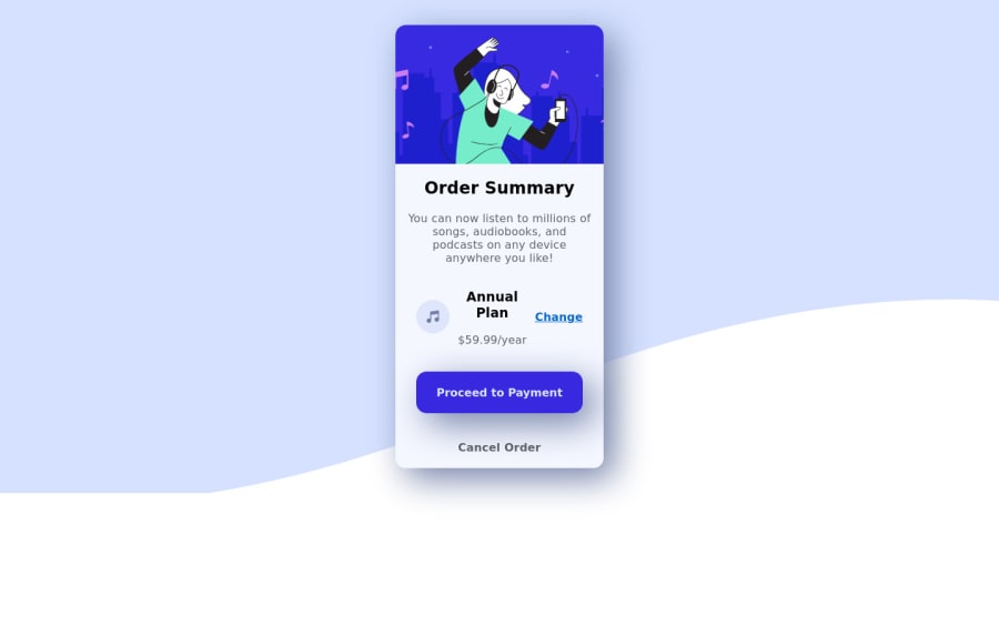
Design comparison
Solution retrospective
I'm comfortable receiving constructive criticism.
Community feedback
- @ChamuMutezvaPosted over 3 years ago
Congratulations for taking your first challenge, well done. Here are a few suggestions:
- The first heading of a site has to be an
h1, It should concisely describe the overall purpose of the content. The current h2 element i would use it as the h1 element - alt values has to descriptive for the benefit of assistive technology users - decorative images can have an emptry alt value. Values like
alt='music-icon'are not that descriptive at the same time words like icon, image, logo, graphic should be avoided as screen readers present such kind of information automatically. - the button should also have a focus state such that keyboard users can know when the focus is on the button when tabbing.
- the site is responsive.
Marked as helpful1@DouglasVDMPosted over 3 years ago@ChamuMutezva Thank for taking the time to review my solution.
- My heading is a h1 in my code.
- Thank you for the tip on alt values. My CSS knowledge is non-existent
- On the button I have :hover that changes the opacity or should it be focus specifically?
0@ChamuMutezvaPosted over 3 years ago@DouglasVDM, hover will work with a mouse but not with a keyboard. Yes you have to add the
focusas well:hover, :focus { opacity: 0.7; }Marked as helpful1@DouglasVDMPosted over 3 years ago@ChamuMutezva Thank you. With you on my side I will be challenging Kevin Powell soon! ;)
0 - The first heading of a site has to be an
- @jaronimas-codesPosted over 3 years ago
Good day, Sir! I would say, spend extra time to make it closer to the design. Background positioning is quite easy to do and change it in media - queries. Play with width, max-width, more padding and margin would be nice too from UI perspective, that would make more white space and more space 'for design to breath' ;) overall it doesn't look bad, but I am sure you can improve that in couple of hours with a help for searching of all extra css features! Good luck!
Marked as helpful1@DouglasVDMPosted over 3 years ago@jaronimas-codes I'm so happy you took the time to review my solution. Thank you. I find it extremely difficult to let go of my projects. I'm always tweaking. Surprised myself by submitting my first solution with very little procrastination. CSS and I can get lost for hours. Taking your advise into account, I will definitely have a few improvements soon. I have a free membership, how can I get the sample image to compare my solution side by side?
0@jaronimas-codesPosted over 3 years ago@DouglasVDM I dont think you can or I haven't took time to find the solution, however training your eye, it is also good too. In the beggining it takes days to complete and that is all right. Cannot say that I am super fast now, but you will get use to have more productive development flow, just try to do your best, come back to fix it, if theres any html or accessibility issues amd you will improve way faster than majority ;)
Marked as helpful1
Please log in to post a comment
Log in with GitHubJoin our Discord community
Join thousands of Frontend Mentor community members taking the challenges, sharing resources, helping each other, and chatting about all things front-end!
Join our Discord
