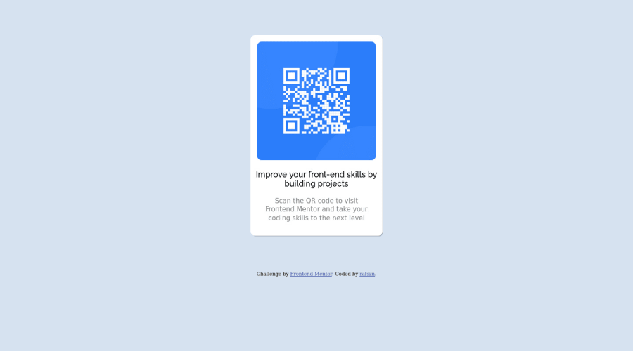
Design comparison
SolutionDesign
Community feedback
- @ecemgoPosted over 1 year ago
Some recommendations regarding your code that could be of interest to you.
- If you want to make the card centered both horizontally and vertically, you'd better add flexbox and
min-height: 100vhto thebody
body { /* margin-top: 80px; */ display: flex; flex-direction: column; justify-content: center; align-items: center; min-height: 100vh; }- When you use flexbox in the
body, you don't need to usemarginin the.containerto center the card - If you use
max-width, the card will be responsive - You'd better give
paddingto give a gap between the content and the border of the card
.container { /* width: 300px; */ max-width: 300px; /* margin: auto; */ /* margin-bottom: 10vh; */ padding: 20px; }- You can add
marginto text instead of usingpadding.
.text p { /* padding: 1px 20px 30px 20px; */ margin-bottom: 20px; }- Finally, if you follow the steps above, the solution will be responsive. You don't need to use media queries and
.imgand you can remove them
/* .img{
    width: 90%;
    margin: auto;
    padding-top: 15px;
} */
Hope I am helpful. :)
0 - If you want to make the card centered both horizontally and vertically, you'd better add flexbox and
Please log in to post a comment
Log in with GitHubJoin our Discord community
Join thousands of Frontend Mentor community members taking the challenges, sharing resources, helping each other, and chatting about all things front-end!
Join our Discord
