Design comparison
SolutionDesign
Community feedback
- @chinh1402Posted about 1 year ago
Hello 👋, well done on finishing the challenge. Your design looks great overall, but here are my ideas to make it look better
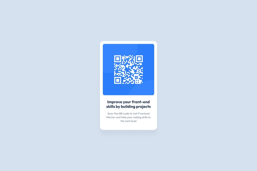
- The description text is a bit too wide, it's too close to the side of the card. You should give it more padding for it to work with. Same thing with your headline text
- The padding you gave for the image is inconsistent. The padding on top is too big while the padding on the sides are too small. You should adjust it, 20px for all sides is a good fit here.
- The rounding of borders is inconsistent as well. The outer card should be rounded more; while the image border, the top part is too small, while the bottom part is too big; As I checked your code, the padding-top of the image just somehow distorted the top part border-radius, which is kind of unfortunate. My work-around for this is: remove all the padding of the image and, instead, add padding onto the card that wrap around the image with that white background, and now you got a nice, lovely image with no distorted border-radius
With those fixes, I think your solution would look much better. What do you think?
Marked as helpful1@Bluz0Posted about 1 year ago@chinh1402 Thank you for your comment, especially for the third point. I had tried a lot of things for the border of the image but I couldn't do it. Thanks to your suggestion it works better! I will modify on github so that we can see
1
Please log in to post a comment
Log in with GitHubJoin our Discord community
Join thousands of Frontend Mentor community members taking the challenges, sharing resources, helping each other, and chatting about all things front-end!
Join our Discord
