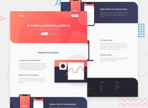
Design comparison
SolutionDesign
Solution retrospective
Hello, i will appreaciate any kind of feedback ;)
Community feedback
- @tedikoPosted over 3 years ago
Hello, Kacper! 👋
Looks very nice, well done. My suggestions:
- In your
.nav__title-listyou should usebuttonsinstead heading tags because they trigger some action. - Try to work on the class names, they are non-intuitive and hard to read in the code.
section1,section2etc are not descriptive. Instead try to name them like.hero,.about,.intro.featuresetc. - Add
:focuspseudo class to interactive elements like anchors, buttons etc. Useoutlineproperty to make your website more accessible to keyboard users. Focusable elements like anchor, buttons or inputs they have applied default:focuspseudo class withoutlineproperty. These default styles are subtle and hardly visible tho. Furthermore every browser has a slightly different default style for the outline, so you probably want to change the default style. Read more about why we should change focus styles.
Good luck with that, have fun coding! 💪
2@IkacperPosted over 3 years ago@tediko Thanks for feedback i will remember about that points.
0 - In your
Please log in to post a comment
Log in with GitHubJoin our Discord community
Join thousands of Frontend Mentor community members taking the challenges, sharing resources, helping each other, and chatting about all things front-end!
Join our Discord
