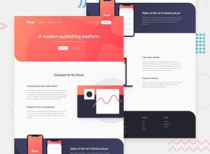
Design comparison
Solution retrospective
First submission. Had a lot of difficulty trying to get the images to be viewed as presented in the design document. Any tips in regards to managing images would be greatly appreciated.
Community feedback
- @fidellimPosted about 3 years ago
Hi Christopher,
Great job finishing your first FEM submission. I just noticed that on mobile view, your navigation content is overlapping if you collapse all nav items. You might want to fix that. Other than great work! I like the hover effect you did for the footer links :)
Well done and I hope the suggestion I made helps :)
0 - @Z-ayatPosted about 3 years ago
Don’t know how the image design looks but in the mobile-view nav links is to close from each other they need some margins
0
Please log in to post a comment
Log in with GitHubJoin our Discord community
Join thousands of Frontend Mentor community members taking the challenges, sharing resources, helping each other, and chatting about all things front-end!
Join our Discord
