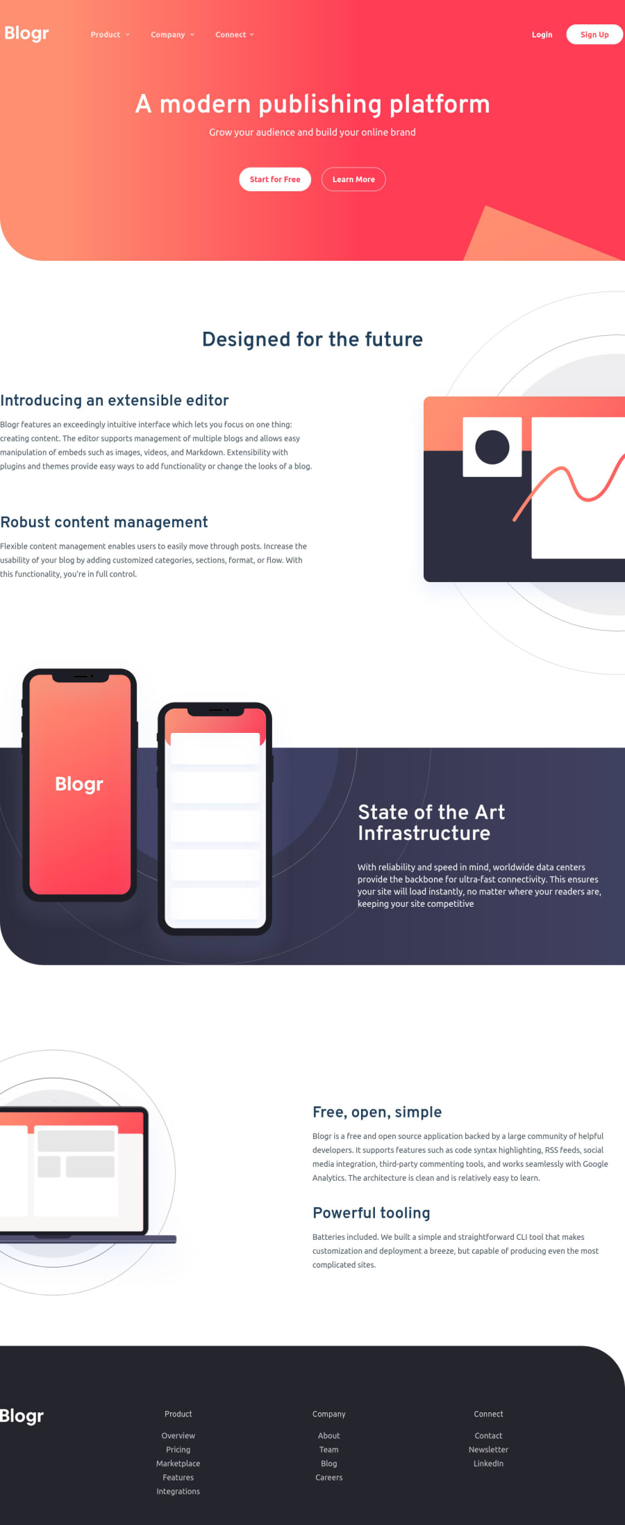
Design comparison
Solution retrospective
One of the toughest challenge so far. I made the accordions using tailwindcss alone using group-hover: & made hamburger menu using basic JS ~ Any feedback will be highly appreciated!
Happy coding! =)
Community feedback
- @BeziesPosted about 2 years ago
HI, Sorry for my poor english but your hamburger / close button don't work very well. You just have to click on the lines to be able to activate it.. and they are very fine..
There is probably a padding problem also for your footer and your "Designed for the future" block.
0 - @TryinghardFEPosted about 2 years ago
EDIT: Fixed
Realized I havent fixed the background on Desktop View yet. Will fix soon. Thanks!
0
Please log in to post a comment
Log in with GitHubJoin our Discord community
Join thousands of Frontend Mentor community members taking the challenges, sharing resources, helping each other, and chatting about all things front-end!
Join our Discord
