Submitted over 2 years ago
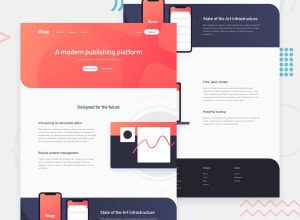
Blogr landing page using Flex box, grid and mobile first work flow.
@Yehan20
Design comparison
SolutionDesign
Solution retrospective
This was bit tough for me , I would like to know how can I correctly make the background image in the header section same as the design is there any way. Also for the images that were needed to be on the side I had to use position relative. I would like to know is there an better way. Finally I enjoyed doing this challenge.
Community feedback
Please log in to post a comment
Log in with GitHubJoin our Discord community
Join thousands of Frontend Mentor community members taking the challenges, sharing resources, helping each other, and chatting about all things front-end!
Join our Discord
