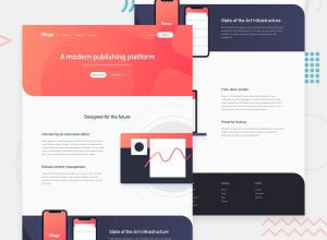
Design comparison
Solution retrospective
Had a couple of headaches with this one...
-
The header bar was a rough time to get right. I managed it by using separate components for submenus on mobile screens and on desktop screens, and I think it turned out great.
-
The sections with the large images that go off-screen was another trouble spot for me. It still doesn't line up with the header's container margin on larger screens, but I'll take what I got.
At the end of the day, I like how this turned out in the end. This was also my first project using the Vite.JS application bundler. Let me know what you think.
Community feedback
- @tedikoPosted over 3 years ago
Hello, Dennis Griffin! 👋
Congrats on finishing another challenge! Your solution responds well. Here's my few suggestions:
- I think applying opacity to header on scroll is bad in this case. It's hard to see elements in header.
- Change
.header__submenu-titlecolor to be more white, this grayish color is very hard to read. - Since your
.phones__imageis decorative youralttext should be provided empty (alt="") so that they can be ignored by assistive technologies, such as screen readers. - Add
:focuspseudo class to interactive elements like anchors, buttons etc. Useoutlineproperty to make your website more accessible to keyboard users. Focusable elements like anchor, buttons or inputs they have applied default:focuspseudo class withoutlineproperty. These default styles are subtle and hardly visible tho. Furthermore every browser has a slightly different default style for the outline, so you probably want to change the default style. Read more about why we should change focus styles.
Good luck with that, have fun coding! 💪
1
Please log in to post a comment
Log in with GitHubJoin our Discord community
Join thousands of Frontend Mentor community members taking the challenges, sharing resources, helping each other, and chatting about all things front-end!
Join our Discord
