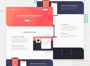
Design comparison
SolutionDesign
Solution retrospective
Spend quite amount of time to align the images/svg properly on different screen size but I really enjoyed doing this challenge. Any feedback is welcome. Thanks!
Community feedback
- @tedikoPosted over 3 years ago
Hello, By! 👋 Congrats on finishing another challenge! Your solution looks very good and also responds well. Here's my few tips:
- Since your
.header__logoimage is an anchor element give it more descriptive alternative text. Something likealt="Blogr - home page"would be great. - Add
:focuspseudo class to interactive elements like anchors, buttons etc. Useoutlineproperty to make your website more accessible to keyboard users. Focusable elements like anchor, buttons or inputs they have applied default:focuspseudo class withoutlineproperty. These default styles are subtle and hardly visible tho. Furthermore every browser has a slightly different default style for the outline, so you probably want to change the default style. Read more about why we should change focus styles. Good luck with that, have fun coding! 💪
1@by-yeePosted over 3 years ago@tediko, thanks for your great feedback. I'll make changes accordingly.
0 - Since your
- Account deleted
This looks and works quite well.
Big up on doing it.
1
Please log in to post a comment
Log in with GitHubJoin our Discord community
Join thousands of Frontend Mentor community members taking the challenges, sharing resources, helping each other, and chatting about all things front-end!
Join our Discord
