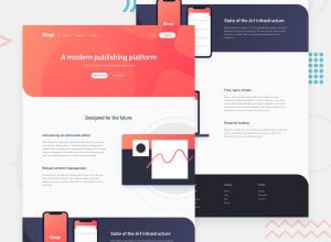
Blogr landing page css html javascript
Design comparison
Solution retrospective
Hello guys,
thank you very much for your time when having a look at this challenge, it's much appreciated.
Have a fab day!
Community feedback
- @kens-visualsPosted about 3 years ago
Hey @michaelastefkova 👋🏻
I have a quick tip which may help to fix most of the accessibility issues, and I've noticed something out that I want to point out.
- If you change this
<section class="header"> ... <section>to<main class="header"> ... <main>, I believe it will fix the most, if not all, of the accessibility issues. Don't forget to generate a new report once you change it. - The only odd thing I noticed is that the
footerhas someone else's name, and when I clicked on it, it took me to some guy's GitHub. I'm not sure if that's what you intended to do 😅
I hope this was helpful 👨🏻💻 other than that, the layout looked really cool. Cheers 👾
Marked as helpful0@michaelastefkovaPosted about 3 years agoThank you very much @kens-visuals It's super helpful and I will try to play with that. Oh, the second thing I forgot to change as it was just a concept for me!
Very observing eye you have:)
Have a fab day!
0@kens-visualsPosted about 3 years ago@michaelastefkova thanks for the compliment 😅
Thanks, you too!
0 - If you change this
- @fidellimPosted about 3 years ago
Hi Michaela,
Looks great for both web and mobile views! Well done :)
0
Please log in to post a comment
Log in with GitHubJoin our Discord community
Join thousands of Frontend Mentor community members taking the challenges, sharing resources, helping each other, and chatting about all things front-end!
Join our Discord
