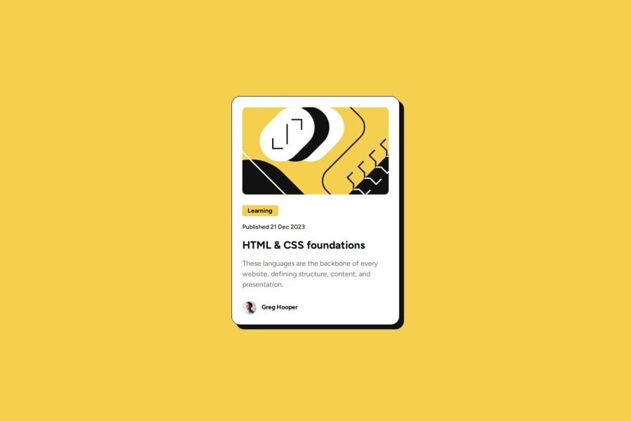


Design comparison
SolutionDesign

Community feedback
- @skyv26Posted 3 months ago
Hi @isioma-talabi 👋
You did an amazing job! 🎉 However, I noticed one issue:
- Responsive Design: When a user resizes the screen width, your card's width remains constant. This could lead to a poor user experience on smaller screens, such as mobile phones. 📱
💡 Suggestion:
Consider using themax-widthCSS property instead of a fixedwidth. Here's why:- The
widthproperty sets an exact size, which may not adapt well to smaller containers. - The
max-widthproperty allows your card to adjust dynamically while ensuring it doesn't exceed a specified size, creating a more responsive design.
I hope this makes sense! 😊 Let me know if you need further clarification. Keep up the great work! 💪✨
Marked as helpful0

Please log in to post a comment
Log in with GitHub
Join our Discord community
Join thousands of Frontend Mentor community members taking the challenges, sharing resources, helping each other, and chatting about all things front-end!
Join our Discord