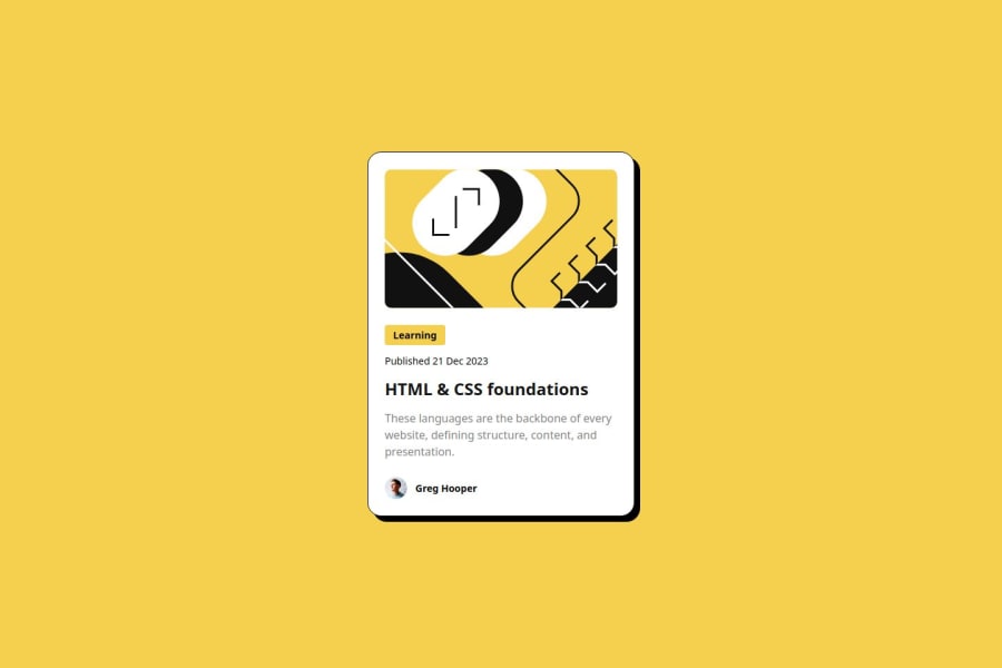
Design comparison
Solution retrospective
"Proud" is a bit strong, but I was happy to make sizing fluid with clamp. Meaning then I don't need to use media queries.
What would I do differently, use some form of CSS naming scheme.
What challenges did you encounter, and how did you overcome them?Mostly splitting up the CSS into separate files / layers, specifically what goes where.
What specific areas of your project would you like help with?None, but any thoughts more than welcome.
Community feedback
- @MatthewPCopePosted about 1 year ago
Great job! It was interesting to see how you split up all the css, it didn't occur to me to do it that way.
0P@tarasisPosted about 1 year ago@MatthewPCope thank you, and hey I’m still not sure that best process.
To me it breaks with the idea of nesting and whether something falls under layout, or a different category. Or base via specific.
I have since come across this article going more into the idea … but the split is still ambiguous at best. Similar to SCSS but how do you draw the line?
https://piccalil.li/blog/how-were-approaching-theming-with-modern-css
My only recent diff is splitting variables/properties into a seperate file so VSCode plugin doesn’t have issues.
0@MatthewPCopePosted about 1 year ago@tarasis I actually had another question I wanted to ask you. How did you know how much top margin to put on the card? Yours lines up perfectly with the design.
0
Please log in to post a comment
Log in with GitHubJoin our Discord community
Join thousands of Frontend Mentor community members taking the challenges, sharing resources, helping each other, and chatting about all things front-end!
Join our Discord
