Not Found
Not Found
Not Found
Not Found
Not Found
Not Found
Not Found
Not Found
Not Found
Not Found
Not Found
Not Found
Not Found
Not Found
Not Found
Not Found
Not Found
Not Found
Not Found
Not Found

Submitted

Blog Preview Card with custom hover and focus

P

@Crtykwod

Desktop design screenshot for the Blog preview card coding challenge

This is a solution for...

  • HTML
  • CSS
1newbie
View challenge

Design comparison


SolutionDesign

Solution retrospective


What are you most proud of, and what would you do differently next time?

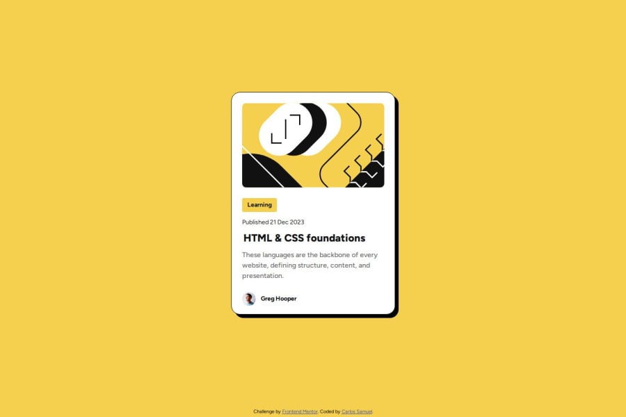
I'm proud that i did the challenge very fast, except by the abstract image.

I tried to put the SVG directly in the code, instead of putting the archive inside a .

I did:


Instead of:

What challenges did you encounter, and how did you overcome them?

The biggest challenge was actually trying to round the edges of an SVG vector instead of just using my brain and placing it in the

What specific areas of your project would you like help with?

Any help is welcomed here!

Community feedback

P
Steven Stroud 9,240

@Stroudy

Posted

Amazing job with this! You’re making fantastic progress. Here are some small tweaks that might take your solution to the next level…

  • These <div> should really have semantic tags like headings (<h1> to <h6>) and paragraphs (<p>) convey structure and meaning to content, improving accessibility, SEO, and readability by helping search engines and screen readers interpret the content.<div>Learning</div>

  • Avoid using id selectors for styling in CSS because they are too specific and hard to override, making your styles less flexible and maintainable. Instead, use class selectors (.), which are reusable and more manageable, allowing for better control over your styles and easier updates.

  • For future project, You could download and host your own fonts using @font-face improves website performance by reducing external requests, provides more control over font usage, ensures consistency across browsers, enhances offline availability, and avoids potential issues if third-party font services become unavailable. Place to get .woff2 fonts

  • Line height is usually unitless to scale proportionally with the font size, keeping text readable across different devices. Best practice is to use a unitless value like 1.5 for flexibility. Avoid using fixed units like px or %, as they don't adapt well to changes in font size or layout.

  • While px is useful for precise, fixed sizing, such as border-width, border-radius, inline-padding, and <img> sizes, it has limitations. Pixels don't scale well with user settings or adapt to different devices, which can negatively impact accessibility and responsiveness. For example, using px for font sizes can make text harder to read on some screens, Check this article why font-size must NEVER be in pixels. In contrast, relative units like rem and em adjust based on the user’s preferences and device settings, making your design more flexible and accessible. Use px where exact sizing is needed, but prefer relative units for scalable layouts. If you want a deeper explanation watch this video by Kevin Powell CSS em and rem explained. Another great resource I found useful is this px to rem converter based on the default font-size of 16 pixel.

You’re doing fantastic! I hope these tips help you as you continue your coding journey. Stay curious and keep experimenting—every challenge is an opportunity to learn. Have fun, and keep coding with confidence! 🌟

Marked as helpful

1

P

@Crtykwod

Posted

Thank you sooo much @Stroudy, for this deep feedback. Just watched Kevil Powell "em and rem" video and now it makes much more sense to me. Also this link to the text fonts is so useful, thanks for sharing.

I really appreciate your review and thanks for the encouragement words! ^-^

1
P
Steven Stroud 9,240

@Stroudy

Posted

Hey @Crtykwod, I’m so glad you found this information useful! Keep building on your knowledge, and remember, every step forward is progress. You’re on the right track, and you’re doing great. Have an awesome day and happy coding! 😊

1
MikDra1 6,650

@MikDra1

Posted

If you want to make your card responsive with ease you can use this technique:

.card {
width: 90%;
max-width: 37.5rem;
}

On the smaller screens card will be 90% of the parent (here body), but as soon as the card will be 37.5rem (600px) it will lock with this size.

Also to put the card in the center I advise you to use this code snippet:

.container {
display: grid;
place-items: center;
}

Hope you found this comment helpful 💗💗💗

Good job and keep going 😁😊😉

0

Please log in to post a comment

Log in with GitHub
Discord logo

Join our Discord community

Join thousands of Frontend Mentor community members taking the challenges, sharing resources, helping each other, and chatting about all things front-end!

Join our Discord